Design is like fashion for your brand—sometimes it’s all about the latest trends, other times it’s about timeless classics. Let’s embark on a whimsical journey through the kaleidoscope of design styles that have strutted down the branding runway, each with its own flair and personality.
1. Neo-Brutalism: The Rebel Without a Pause
Description: Imagine if your website had a bad hair day and decided to embrace it. Neo-Brutalism is the design equivalent of wearing mismatched socks on purpose. It’s raw, it’s bold, and it doesn’t care if you understand it.
Case Study: Figma, the design tool that makes designers feel like wizards, has dabbled in this style. Their marketing campaigns and community-driven landing pages use bold, contrasting colors with raw, grid-based layouts. It’s like they threw a design party and invited every color in the crayon box.
Example: Figma’s Config 2023 event webpage. It’s like a design mosh pit—chaotic, energetic, and oddly satisfying.
2. Minimalism: Less Is More, Except When It’s Not
Description: Minimalism is the design world’s version of a diet—cutting out the unnecessary to focus on the essentials. It’s clean lines, ample white space, and the occasional splash of color to keep things interesting.
Case Study: Apple, the tech giant that makes you feel inadequate for not owning their latest gadget, is a minimalist maestro. Their marketing campaigns focus on minimalist aesthetics, showcasing their products against white or muted backgrounds. It’s like they invented the concept of ‘less is more’ and then patented it.
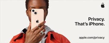
Example: iPhone ads highlighting a single feature with ample white space. It’s like they’re saying, “Look at this feature. Isn’t it amazing? Now, look at this empty space. Isn’t it amazing too?”
3. Maximalism: More Is More, Baby
Description: If minimalism is the diet, maximalism is the all-you-can-eat buffet. It’s an explosion of patterns, textures, and bold colors. Think of it as design’s way of saying, “Why settle for one when you can have ten?”
Case Study: Gucci, the brand that makes you question your entire wardrobe, is a maximalist’s dream. Their campaigns are known for combining multiple patterns, textures, and colors, creating a luxurious and eclectic visual identity. It’s like they threw a design party and invited every pattern and color they could find.
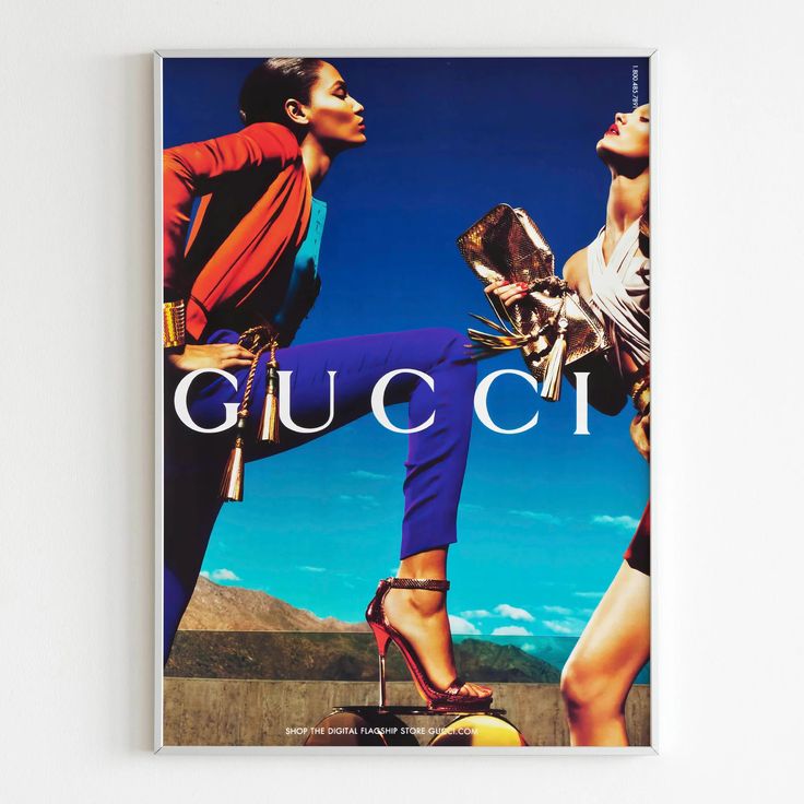
Example: Gucci’s “Gucci Aria” collection ads. It’s like a design fever dream—vibrant, eclectic, and a little bit dizzying.
4. Retro Futurism: Yesterday’s Tomorrow, Today
Description: Retro Futurism is like looking at the past through a sci-fi lens. It combines vintage elements with futuristic aesthetics, creating a nostalgic yet forward-thinking vibe.
Case Study: Netflix’s promotional content for “Stranger Things” is a masterclass in retro-futuristic design. They’ve leveraged neon colors and 80s-inspired typography to create a sense of nostalgia with a modern twist. It’s like they time-traveled to the 80s, grabbed some design elements, and brought them back to the future.

Example: Posters for “Stranger Things” Season 4. It’s like a neon-lit trip down memory lane, with a few unexpected detours.
5. Art Deco: The Gatsby of Design
Description: Art Deco is the design equivalent of a jazz age party—glamorous, opulent, and a little bit over the top. Characterized by geometric patterns, metallic finishes, and luxurious details, it’s like design’s way of saying, “Go big or go home.”
Case Study: Chanel, the brand that makes you feel like you should be sipping champagne in a Parisian café, often incorporates Art Deco motifs. From symmetrical lines to ornate details, their designs exude luxury and sophistication. It’s like they took the Roaring Twenties, added a dash of modern flair, and created timeless elegance.
Example: Vintage Chanel perfume posters. It’s like stepping into a black-and-white movie—elegant, timeless, and just a little bit mysterious.
6. Flat Design: No Frills, Just Thrills
Description: Flat Design is the minimalist’s cousin who doesn’t believe in gradients or textures. It’s all about simplicity, focusing on clean, 2D graphics without any unnecessary embellishments.
Case Study: Google’s Material Design is a prime example of Flat Design. It simplifies user interfaces, focusing on flat, clean layouts with pops of vibrant color. It’s like they took the ‘less is more’ mantra and turned it into a design philosophy.

Example: Android interface and Google Drive app design. It’s like using a digital tool that’s as straightforward as a paperclip—functional, efficient, and no nonsense.
7. Skeuomorphism: The Imitation Game
Description: Skeuomorphism is like the design world’s method acting—mimicking real-world objects to make digital interfaces feel familiar. It’s about creating elements that resemble their real-world counterparts, complete with textures and shadows.
Case Study: Apple’s early iOS designs were the poster child for Skeuomorphism. Apps like Notes resembled a notepad, and Calendar looked like a physical calendar. It was like they were saying, “Don’t worry, this digital thing is just like the real thing.”
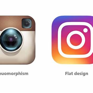
Example: iOS 6 interface. It’s like using a digital device that feels like a cozy, familiar object—until you realize it’s actually a sleek piece of technology.
8. Abstract Expressionism: The Art School Dropout
Description: Abstract Expressionism is the rebellious teenager of design styles. It throws out the rulebook and says, “Let’s just make something that feels right.” It’s all about vibrant, unconventional shapes and emotions.
Case Study: Absolut Vodka’s bottle design often features bold, abstract elements representing themes like seasons or cities. It’s like they took a blank canvas and splattered it with creativity.
Example: Absolut “Cities” campaign. It’s like a visual rollercoaster—unexpected, thrilling, and a little bit dizzying.

9. Swiss Design (International Style): The Overachiever
Description: Swiss Design is the straight-A student of design styles. It’s grid-based, clean, and focused on functionality. It’s like the design equivalent of a well-organized closet—everything has its place.
Case Study: Brands like American Airlines and Lufthansa use Helvetica in branding to exude clarity and professionalism. It’s like they hired a design tutor to make sure everything looks just right.
Example: Lufthansa’s clean and consistent branding. It’s like a design symphony—everything in harmony, nothing out of place.

10. Surrealism: The Dreamer’s Playground
Description: Surrealism is like the design world’s dream sequence—realistic elements blended with dreamlike visuals. It’s about creating a sense of wonder and intrigue.
Case Study: Salvador Dalí’s collaboration with Chupa Chups infused surrealistic elements into the brand’s playful aesthetic. It’s like they took a candy and turned it into a piece of art.
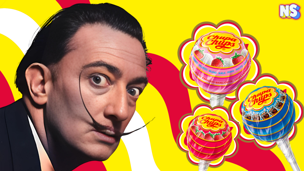
Example: Chupa Chups logo and branding campaigns. It’s like a visual riddle—fun, quirky, and a little bit puzzling.
11. Memphis Design: The Party Animal
Description: Memphis Design is like the life of the design party—playful, colorful, and geometric. It’s all about making things fun and exciting.
Case Study: Spotify’s early campaigns used Memphis-inspired elements to appeal to younger audiences. It’s like they threw a design rave and invited everyone.
Example: 2019 “Wrapped” campaign. It’s like a design confetti explosion—vibrant, energetic, and impossible to ignore.

12. Bauhaus Design: The Functionalist
Description: Bauhaus Design is like the design world’s engineer—functionality meets aesthetics, emphasizing geometric forms and primary colors. It’s about making things that are both beautiful and useful.

Case Study: Airbnb’s branding subtly incorporates Bauhaus principles through clean layouts and intuitive UI design. It’s like they built a design bridge between form and function.
Example: Airbnb’s website redesign (2014). It’s like a design handshake—welcoming, efficient, and well-structured.
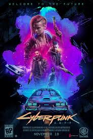
13. Cyberpunk: The Neon Dream
Description: Cyberpunk is like the design world’s neon-lit dystopia—futuristic, edgy, and a little bit rebellious. It’s about blending high-tech with low-life.
Case Study: CD Projekt Red’s “Cyberpunk 2077” promotional materials embody the essence of cyberpunk, featuring neon lights and urban chaos. It’s like they built a digital cityscape and invited you to explore.
Example: Cyberpunk 2077 launch posters. It’s like a visual acid trip—vibrant, chaotic, and utterly captivating.
14. Organic Design: The Nature Lover
Description: Organic Design is like the design world’s tree-hugger—flowing shapes, earthy tones, and a love for nature. It’s about creating designs that feel natural and harmonious.
Case Study: Aesop’s packaging and retail store designs reflect organic principles with minimal, nature-inspired aesthetics. It’s like they took a walk in the forest and brought back some design inspiration.
Example: Aesop skincare stores. It’s like stepping into a botanical garden—calming, refreshing, and beautifully designed.

15. Vintage/Retro Design: The Nostalgic Soul
Description: Vintage/Retro Design is like the design world’s time traveler—evoking nostalgia using elements from specific past decades. It’s about bringing back the good old days with a modern twist.
Case Study: Coca-Cola uses vintage branding for limited-edition products to create nostalgia. It’s like they bottled up a piece of history and handed it to you.
Example: Coca-Cola’s 125th Anniversary Campaign. It’s like a design time capsule—classic, timeless, and always refreshing.
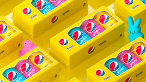
16. Kitsch Design: The Quirky Entertainer
Description: Kitsch Design is like the design world’s party animal—bold, playful, and unapologetically over the top. It’s all about embracing the gaudy, the sentimental, and the downright tacky, often with a wink and a nod. Think of it as the design equivalent of wearing socks with sandals—it’s so wrong, it’s right.
Case Study: Pepsi’s collaboration with Peeps, the marshmallow candy, is a prime example of Kitsch Design. They combined pastel colors, quirky patterns, and a sense of fun to create a product that was both nostalgic and novel. It’s like they took a sugar rush and turned it into a beverage.
Example: Pepsi x Peeps packaging (2021). It’s like a candy-colored fever dream—sweet, sticky, and impossible to ignore.
17. Grunge Design: The Rebel
Description: Grunge Design is the design world’s bad boy—distressed textures, muted tones, and a gritty, rebellious vibe. It’s about embracing imperfection and celebrating the raw, unpolished side of life. Think of it as the design equivalent of a leather jacket—edgy, cool, and a little bit dangerous.
Case Study: Nirvana’s album covers and merchandise epitomize Grunge Design. They used distressed fonts, dark colors, and a DIY aesthetic to capture the angst and energy of the grunge movement. It’s like they took a flannel shirt and turned it into art.
Example: Nevermind album artwork. It’s like a visual mosh pit—chaotic, raw, and full of attitude.
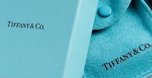
18. Monochromatic Design: The Minimalist’s Dream
Description: Monochromatic Design is like the design world’s zen master—using shades, tints, and tones of a single color to create harmony and simplicity. It’s about finding beauty in uniformity and creating a cohesive, soothing aesthetic. Think of it as the design equivalent of a single-origin coffee—pure, unadulterated, and satisfying.
Case Study: Tiffany & Co.’s exclusive use of Tiffany Blue in its packaging and marketing defines its luxurious identity. They’ve turned a single color into a symbol of elegance and exclusivity. It’s like they took a color and made it a status symbol.
Example: Tiffany & Co. boxes and ads. It’s like a visual lullaby—calming, consistent, and unmistakably chic.
19. Isometric Design: The 3D Illusionist
Description: Isometric Design is like the design world’s magician—creating 3D-like, detailed compositions on a 2D plane. It’s about adding depth and dimension without the need for perspective, making flat designs pop. Think of it as the design equivalent of a hologram—mesmerizing, intricate, and a little bit mind-bending.
Case Study: Slack’s illustrations for onboarding and marketing frequently use Isometric Design to explain complex ideas simply. They’ve mastered the art of making the complicated look easy and engaging. It’s like they took a Rubik’s Cube and turned it into a user-friendly interface.
Example: Slack’s website graphics. It’s like a visual puzzle—intricate, engaging, and rewarding to explore.
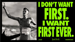
20. Asymmetrical Design: The Rule Breaker
Description: Asymmetrical Design is like the design world’s rebel—breaking symmetry rules for a dynamic effect. It’s about creating tension and interest by deliberately avoiding balance, making designs feel more organic and lively. Think of it as the design equivalent of a jazz solo—unexpected, thrilling, and full of surprises.
Case Study: Nike’s advertisements use Asymmetry to focus attention on athletes and their movements. They’ve turned the human form into a dynamic, ever-evolving design element. It’s like they took a sprint and turned it into a visual masterpiece.
Example: “Just Do It” campaign visuals. It’s like a visual sprint—fast-paced, energetic, and impossible to look away from.
Conclusion: The Design Buffet
In the grand buffet of design styles, there’s something for every palate. Whether you’re craving the bold flavors of Maximalism, the clean lines of Minimalism, or the rebellious spirit of Grunge, the world of design offers a smorgasbord of aesthetics to feast upon. So, the next time you’re planning a branding campaign or designing a new product, consider which design style best serves your message and resonates with your audience. After all, in the world of design, as in life, variety is the spice of creativity.
