Gather ‘round, brand enthusiasts and casual observers alike! The year 2024 has been a whirlwind of rebranding escapades, with companies donning new identities like they’re trying on hats at a vintage store. Some fits are snug and stylish, while others… well, let’s just say they’re more “abstract art.” Let’s embark on this journey through the most talked-about rebrands of the year.
1. Abrdn: When Vowels Are So Last Season
Remember Standard Life Aberdeen? Neither do we, because they’ve rebranded to Abrdn (pronounced “Aberdeen”). In a move that left linguists clutching their dictionaries, the company decided vowels were overrated. CEO Jason Windsor stands by the choice, stating, “The name is the name,” which is as tautological as it is unhelpful. Despite the internet’s collective eyebrow raise, Abrdn is sticking to its consonant-heavy guns.
abrdn
Takeaway: Sometimes, rebranding is less about making sense and more about making headlines.
2. Campbell’s Soup: Stirring the Pot
After 155 years, the iconic Campbell Soup Company decided to drop “Soup” from its name, rebranding as The Campbell’s Company. This shift reflects their venture beyond soups into the lucrative snack market. While some consumers fear this change might lead to price hikes, others are just wondering if their beloved tomato soup is now considered a “drinkable snack.”

Takeaway: When life gives you soup, make snacks.
3. Zoom: From Video Calls to AI Calls
Zoom, the savior of remote work, has rebranded itself as an AI-first company, now known as Zoom Communications Inc. With features like the AI Companion, Zoom aims to summarize meetings and draft emails, potentially enabling a four-day workweek. Because nothing says “progress” like having a robot tell you what you just discussed.
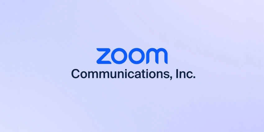
Takeaway: In the future, even your small talk might be automated.
4. Jaguar: Pouncing into Controversy
Jaguar took a bold leap by rebranding as JaGUar, embracing vibrant colors and an emphasis on electric vehicles. This departure from their classic British elegance has sparked debates about the importance of heritage in branding.
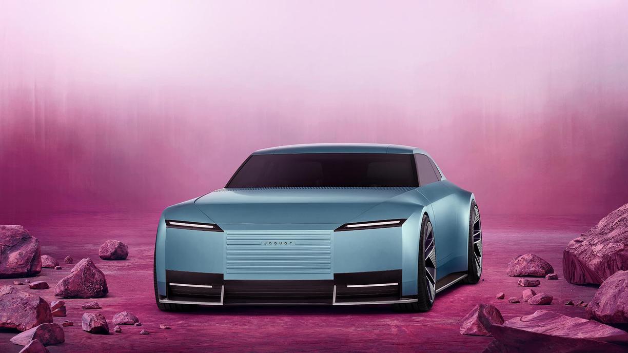
Apparently, not everyone is ready for a neon green Jaguar zipping through the countryside.
Takeaway: Rebranding can be a wild ride; just make sure your audience is buckled in.
5. Pepsi: Back to the Future
Pepsi decided to tap into nostalgia by reviving its 1980s and ‘90s aesthetics. The new logo features the classic red, white, and blue globe paired with a modern sans-serif font.

It’s a nod to the past with a foot firmly in the present, much like wearing vintage jeans with a smartwatch.
Takeaway: Sometimes, the best way forward is a step back—preferably with a moonwalk.
6. RSPCA: From Stuffy to Snazzy
The RSPCA unveiled its first major rebrand in 50 years, ditching the somber blue and octagonal logo for a vibrant, digitally friendly palette. The custom font draws inspiration from protest placards, adding character and depth.

It’s a fresh look aimed at appealing to younger, diverse audiences, because who says animal welfare can’t be trendy?
Takeaway: Even the most established institutions can benefit from a makeover—just ask your grandma.
7. Eurostar: All Aboard the Chic Express
Eurostar revamped its image with a sophisticated rebrand, introducing a bold, sans-serif wordmark and a luxurious navy and gold color scheme. The design exudes European elegance, making your train ride feel like a first-class ticket to style town.

Takeaway: A touch of class can transform even the humblest of journeys.
8. Bumble: Buzzing with Empowerment
Bumble refreshed its brand identity by simplifying its logo to a honeycomb-inspired symbol and tweaking its signature yellow to a warmer hue.
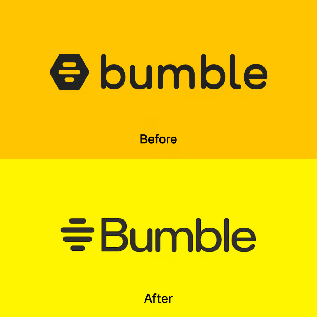
The update reinforces its commitment to positivity and building meaningful relationships, proving that even dating apps can have a glow-up.
Takeaway: A little polish can make your brand shine brighter in the crowded app store.
9. Decathlon: Sporting a New Look
Decathlon, the go-to for affordable sports gear, introduced a sleek, sans-serif wordmark and a vibrant color palette.
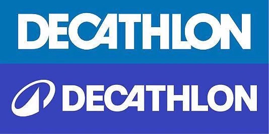
The addition of a new icon symbolizes motion and versatility, aligning with their mission to make sports accessible to all.
Takeaway: An energetic rebrand can breathe new life into even the most established retailers.
10. Coca-Cola: Classic with a Twist
Coca-Cola refreshed its brand by updating its color palette and typography to reflect a modern and sustainable approach.
The subtle changes aim to position the brand as environmentally friendly while maintaining its iconic status.
Takeaway: Even the classics need a little tune-up to stay relevant.
11. Instagram: Minimalism Meets Social Media
Instagram took a bold leap into the world of ultra-minimalism, trading its iconic gradient-heavy look for a sleeker, monochromatic design. The familiar hues of purple, pink, and orange have been softened into a streamlined, black-and-white interface.

While some users praised the design for being modern and chic, others complained that it now resembles a corporate presentation deck. “Where’s the personality?” lamented one Twitter user, who might still be mourning the loss of chronological posts.
Takeaway: Minimalism is great—until you strip away the fun.
12. Subway: Fresh Look, Same Sandwich Smell
After nearly 60 years of consistency, Subway took a bite out of the rebranding pie. Their new logo features a bolder font and a refined arrow design, symbolizing speed and efficiency (because apparently, we needed reassurance that sandwiches are fast). The real kicker? They unveiled their first menu overhaul in decades, with fresh ingredients and even fresher marketing campaigns. It’s a classic case of, “New year, new me—but still a six-inch sub.”

Takeaway: If your product hasn’t changed in decades, a rebrand is the lettuce to your branding sandwich.
13. Twitter to X: The Big Identity Crisis
Elon Musk’s takeover of Twitter didn’t just shake up the tech world; it sent branding enthusiasts into a frenzy. The company dropped its iconic bluebird logo, replacing it with a stark “X.” Why? Nobody really knows. While Musk described it as the “future of limitless interactivity,” many felt the rebrand was an unnecessary flex. Critics compared it to a sci-fi villain’s lair, while fans argued it was sleek and futuristic. Either way, it’s giving off strong “mid-life crisis” vibes.

Takeaway: Sometimes, rebrands are less about innovation and more about making noise—whether it’s the good kind or the bad.
14. Taco Bell: Retro Revival
Taco Bell leaned into the retro trend with a nod to its vibrant 1990s branding. They brought back the funky, colorful designs that once adorned their wrappers and storefronts, much to the delight of Millennials looking for nostalgia with a side of nachos.
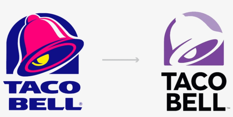
Paired with new, playful campaigns like “Live Más Throwback Thursdays,” the rebrand sparked social media buzz. Their message is clear: they’re here for the vibes, and maybe some tacos.
Takeaway: If your audience craves nostalgia, why not serve it up with extra guac?
15. Skype: The Quiet Comeback
Poor Skype. Once the reigning king of video calls, it lost its crown to Zoom during the pandemic. But instead of sulking, Skype quietly rolled out a rebrand in 2024, featuring a softer logo and a tagline emphasizing “human connection.” It’s like they’re whispering, “Hey, remember us? We’re still here… please call your grandma.”

Takeaway: In a crowded market, sometimes a rebrand is about gently nudging your way back into relevance.
16. Barbie: Riding the Wave of Movie Magic
Mattel’s Barbie franchise rode the massive success of the 2023 Barbie movie straight into a rebrand. Gone are the ultra-pink clichés; the new Barbie branding embraces inclusivity and empowerment with designs showcasing a diverse array of dolls and updated messaging like “You Can Be Anything.” The rebrand feels like Barbie finally grew up, trading her dream house for a thoughtful apartment with good Wi-Fi.

Takeaway: Cultural relevance + clever marketing =unstoppable branding magic.
Barbie proved that even icons can evolve, and sometimes, the right time for a rebrand is when the world’s already talking about you.

17. Nokia: A Blast From the Past, With a Future Spin
Remember when Nokia was synonymous with indestructible phones? Well, they’re back, and they mean business—literally. Nokia’s recent rebrand stripped away nostalgia and positioned them as a serious tech company focused on 5G, AI, and enterprise solutions. Their updated logo is sharp, modern, and completely unrecognizable to anyone still clutching their old 3310. Nostalgic fans were quick to tweet, “Bring back Snake!”
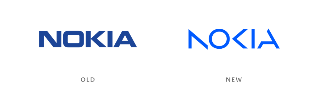
Takeaway: Rebrands can break away from nostalgia to build a futuristic identity, even if it means leaving your fan base scratching their heads.
18. Heinz: Ketchup, But Make It Couture
Heinz has always been a pantry staple, but their recent rebrand gave the brand a fashionable edge. Emphasizing their iconic keystone label and premium quality, Heinz elevated their packaging with a minimalist, monochromatic palette.

They even launched a limited-edition designer ketchup bottle in collaboration with a luxury fashion brand. Social media couldn’t get enough of it: “Ketchup… but make it bougie.”
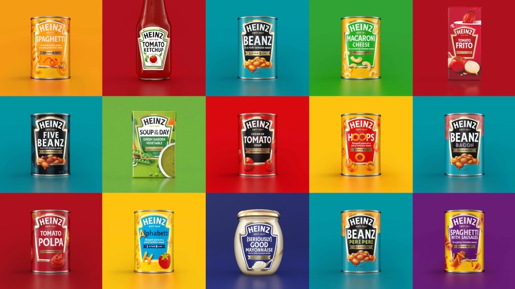
Takeaway: Even the simplest products can benefit from a glow-up if you blend timeless design with unexpected luxury.
19. Burger King: Retro with a Side of Whopper
Burger King’s rebrand went all-in on the nostalgia trend, swapping its modern logo for a retro-inspired design reminiscent of its 1970s aesthetic.

The rebrand extended to packaging, uniforms, and even store designs, creating a cohesive “old is new” vibe. It’s a full meal of branding consistency that fans have been devouring—literally.
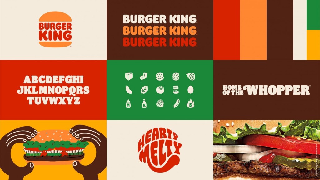
Takeaway: If it worked before, why not try it again? Nostalgia sells, especially when served with fries.
20. Adidas: Lacing Up Sustainability
Adidas recently rebranded to focus on sustainability, launching their “Run for the Planet” campaign.

They highlighted their eco-friendly products, including sneakers made from recycled ocean plastic, alongside a sleeker, simplified logo. The rebrand aims to show that the brand isn’t just keeping up with the times—it’s running ahead.

Takeaway: Aligning your brand with global concerns is more than just trendy; it’s necessary.
21. Airbnb: From Travel App to Lifestyle Brand
Airbnb’s rebrand expanded its focus from just travel to the broader concept of “belonging.” Their logo remains the same, but the messaging and campaigns emphasize unique, authentic experiences and community connections. With ads featuring everything from cozy cottages to castle stays, Airbnb isn’t just selling rooms—it’s selling dreams.

Takeaway: A rebrand doesn’t have to be visual; redefining your message can make your audience see your brand in a whole new way.
22. Taco John’s: Trademark Troubles Lead to Reinvention
Taco John’s made headlines in 2024 for losing their trademark on the phrase “Taco Tuesday,” thanks to a legal challenge by LeBron James. Rather than sulking, they embraced the moment with a cheeky rebrand, launching a campaign called “Taco Tuesday : The People’s Day.”
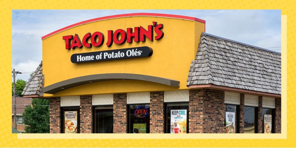
The logo stayed the same, but the messaging was all about fun and letting fans own the phrase.
23. Meta: Connecting the Dots (or Just Confusing Everyone)
When Facebook rebranded as Meta, the internet collectively scratched its head. The new name and infinity-loop logo aim to position Meta as a leader in the metaverse—whatever that means. While some applauded the forward-thinking vision, others joked that Meta sounds like a tech company trying too hard to be cool at a party.

Takeaway: Ambitious rebrands can be polarizing, but they also spark conversations—and isn’t that the point?
The Art of Rebranding: What We Can Learn
After dissecting these rebrands, it’s clear there’s no one-size-fits-all approach. Here are the key lessons we can learn:
1. Know Your Why: As Simon Sinek would say, always start with why. Whether it’s connecting with nostalgia, emphasizing sustainability, or adapting to new markets, your rebrand needs a purpose.
2. Timing Is Everything: Strike when the iron is hot. Whether riding a cultural wave (Barbie) or reclaiming relevance (Skype), timing can make or break your rebrand.
3. Nostalgia Sells, but Innovation Sticks: Tapping into nostalgia is great for short-term buzz, but innovation ensures longevity (Pepsi and Meta).
4. Be Bold, but Stay True: Don’t alienate your core audience while chasing new trends (Twitter X, looking at you).
5. Visuals Matter, But Stories Win: A shiny new logo is great, but it’s the story behind the rebrand that builds emotional connections (Zomato and Airbnb).
Closing Thoughts
Rebranding is a lot like giving your brand a makeover—it’s exciting, nerve-wracking, and a little risky. But when done right, it can catapult a brand into the next era. So, whether you’re ditching nostalgia for innovation, leaning into sustainability, or just giving your packaging a glow-up, remember this: your brand’s true power lies not in its look, but in its ability to resonate with your audience.
Now, go forth and judge these rebrands. Which one’s your favorite, and which one makes you miss the old days? Let’s discuss in the comments!
