Ah, Valentine’s Day—a time when love is in the air, chocolates are in the shopping carts, and marketers are in overdrive. In 2025, brands worldwide pulled out all the stops to woo consumers’ hearts (and wallets). From grand romantic gestures to cheeky anti-Valentine’s messages, here are the top campaigns that made us laugh, cry, and, most importantly, buy.
Global Campaigns
1. Burberry’s “British Romance”
This year, Burberry decided to drape us in more than just their iconic trench coats. Their “British Romance” campaign featured a series of short films set in picturesque UK locales, showcasing couples (and a few well-dressed singles) navigating the complexities of modern love. The twist? Each story was subtly tied to a Burberry product, making it clear that while love might be complicated, choosing the right outfit shouldn’t be.
2. Ben & Jerry’s “Chocolate Covered Strawberry” Flavor Launch
Ben & Jerry’s knows the way to our hearts is through our stomachs. They introduced a limited-edition “Chocolate Covered Strawberry” ice cream, combining a creamy strawberry base with rich chocolate fudge flakes. The campaign featured couples sharing a pint, emphasizing that while relationships can be rocky, ice cream is always smooth.
3. Bath & Body Works x Sweethearts Collaboration
Nostalgia, meet fragrance. Bath & Body Works teamed up with Sweethearts candies to create a line of scented products that transported us back to passing notes in class. With scents like “Be Mine Berry” and “Cutie Pie Citrus,” the collection was a hit among those looking to relive their teenage crushes—minus the awkward braces phase.
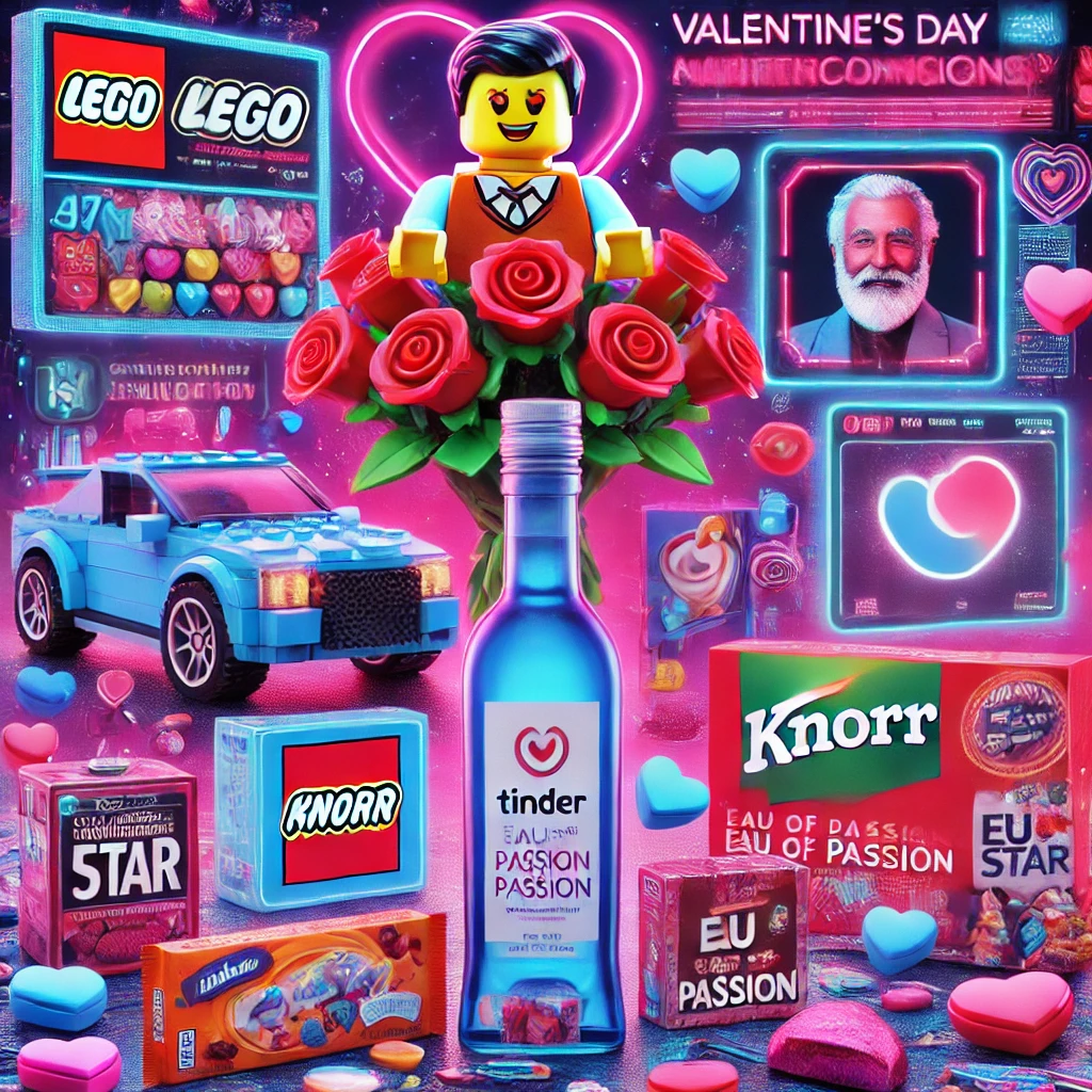
4. LEGO’s “Botanical Love”
For those who prefer plants that don’t require watering, LEGO’s “Botanical Love” campaign was a godsend. They introduced buildable flower sets, allowing customers to construct their own everlasting bouquets. The campaign featured DIY tutorials and showcased how building together can be a bonding experience—because nothing says love like arguing over missing pieces.
5. Savage X Fenty’s “Love Your Way”
Rihanna’s lingerie brand, Savage X Fenty, continued its mission of inclusivity with the “Love Your Way” campaign. Featuring individuals of all genders, sizes, and relationship statuses, the campaign celebrated self-love and confidence. The message was clear: whether you’re single, taken, or “it’s complicated,” you deserve to feel sexy.
6. Hershey’s “Sometimes, Love Sounds Like”
Hershey’s melted our hearts with their “Sometimes, Love Sounds Like” campaign. Through a series of short films, they highlighted the sounds that signify love—from the crinkle of unwrapping a Hershey’s Kiss to the sizzle of a home-cooked meal. It was an auditory journey that reminded us that love isn’t just seen; it’s heard (and tasted).
7. Crocs’ “Lonely Hearts Club”
Embracing the singletons, Crocs launched the “Lonely Hearts Club” collection, featuring limited-edition designs for those flying solo. The campaign encouraged self-love and comfort, proving that you don’t need a partner to rock a pair of stylish (and comfy) footwear. After all, who needs a date when you’ve got Crocs?
8. Lidl’s “Random Acts of Kindness”
Supermarket chain Lidl took a philanthropic approach with their Valentine’s campaign. They offered half a million customers £5 off their next shop and free treats as part of “Random Acts of Kindness Day.” It was a sweet reminder that love isn’t just about grand gestures; sometimes, it’s about a free croissant.
9. Benny Blanco’s “Cheesy Love”
Music producer Benny Blanco took an unconventional route by gifting Selena Gomez a bathtub filled with nacho cheese for Valentine’s Day. Complemented by a trail of chips leading to the tub, the gesture was both hilarious and heartwarming. It served as a reminder that love doesn’t always have to be serious—sometimes, it’s downright cheesy.
10. Costco’s “Loveflation” Roses
Costco made headlines when the price of their Valentine’s Day bouquets skyrocketed overnight from $18.99 to $34.99. Dubbed “Loveflation” by amused customers, the incident sparked debates about supply and demand, and served as a cheeky reminder that love can be costly—especially when procrastinating on flower purchases.
11. Knorr x Tinder’s “Unlock Your Green Flag”
In a delightful fusion of culinary passion and modern dating, Knorr partnered with Tinder to launch the “Unlock Your Green Flag” campaign. Recognizing that 93% of Gen Z singles find cooking an attractive trait, the initiative encouraged Tinder users to highlight their culinary skills in their profiles. This collaboration not only spiced up dating conversations but also underscored the universal appeal of a good meal in forging connections.
Indian Campaigns
1. Cadbury 5 Star’s “Destroy Valentine’s Day”
Taking a humorous stance, Cadbury 5 Star’s “Destroy Valentine’s Day” campaign enlisted “uncles” to disrupt romantic traditions. Targeting those indifferent to the holiday, the campaign featured comedic scenarios where well-meaning elders hilariously intervened in young couples’ plans, reminding us that love isn’t always a smooth ride.
2. Zepto’s “Gifts for Every Love Story”
Quick commerce platform Zepto celebrated love in all its forms with the “Gifts for Every Love Story” campaign. From young couples to lifelong partners, the ads showcased diverse relationships and highlighted Zepto’s wide range of gifts, making thoughtful gestures accessible and convenient.
3. Girl Effect’s “#SacchaPyaarKyaHaiYaar”
Girl Effect India’s Chhaa Jaa initiative sparked essential conversations with the “#SacchaPyaarKyaHaiYaar” campaign. Through engaging podcasts, it focused on themes of love, consent, and gender roles, encouraging young audiences to reflect on the true meaning of love beyond traditional norms.
4. FNP’s “#PyaarAisaKaro”
Ferns N Petals (FNP) collaborated with over 165 brands for the “#PyaarAisaKaro” campaign, including Giva, The Body Shop, Tata Play Binge, Simpl, and Pizza Hut. Emphasizing meaningful gifting during the Valentine’s season, the campaign featured strategic partnerships and co-branded content, encouraging consumers to express love in thoughtful ways.
5. Revaa’s “Love the Hidden You!”
Revaa, a brand synonymous with comfort and sustainability, launched the “Love the Hidden You!” campaign, focusing on self-care during the Valentine’s season. Running from 7th to 16th February 2025, the initiative encouraged individuals to prioritize their well-being. The campaign included engaging social media content and interactive activities, promoting self-acceptance and confidence. As part of the initiative, Revaa offered a “Buy 2, Get 2” promotion on reusable period panties, aligning with its focus on comfort and sustainability.
6. Cadbury Silk’s “Say It with Silk”
Cadbury Silk continued its tradition of being the messenger of love with the “Say It with Silk” campaign. This year, they introduced packaging featuring pre-written love notes, making it easier for the romantically challenged to express their feelings. The campaign reinforced the chocolate as a symbol of love and romance, ensuring that even the most tongue-tied lovers had a sweet way to convey their emotions.
7. MakeMyTrip’s “Love Travel Stories”
Capitalizing on the wanderlust of young couples, MakeMyTrip’s “Love Travel Stories” campaign offered special Valentine’s travel packages. The campaign featured real-life couples sharing their travel experiences, inspiring others to create their own romantic getaways. With discounts on couple-friendly destinations and curated itineraries, MakeMyTrip made it easier for lovebirds to explore new horizons together.
8. Myntra’s “Fashionable Together”
Myntra’s “Fashionable Together” campaign targeted couples looking to flaunt coordinated outfits. The online fashion retailer curated a special Valentine’s collection featuring matching ensembles for couples. With influencers showcasing their #FashionableTogether looks, the campaign encouraged partners to celebrate their unity in style.
9. Swiggy’s “Food Is Love”
Understanding that the way to many hearts is through the stomach, Swiggy’s “Food Is Love” campaign offered special Valentine’s Day meal deals. Partnering with popular restaurants, Swiggy provided curated menus for couples, singles, and even groups of friends celebrating together. The campaign also featured a contest where users shared their most memorable food-related love stories, with winners receiving free meals.
10. Tanishq’s “When It Rings True”
Jewelry brand Tanishq’s “When It Rings True” campaign focused on the significance of rings in expressing commitment. Through a series of heartwarming ads, the campaign showcased diverse couples exchanging rings to mark various milestones, not just engagements. Tanishq emphasized that a ring is a symbol of any promise that rings true, resonating with both traditional and modern couples.
11. Domino’s “Eau de Passion” Perfume Launch
Taking an unconventional route, Domino’s introduced “Eau de Passion,” a limited-edition perfume inspired by the tantalizing aroma of pepperoni pizza. With spicy top notes and a warm, cheesy base, this fragrance playfully suggested that the way to someone’s heart might just be through their sense of smell. The campaign generated buzz with influencer partnerships and exclusive giveaways, making it a hot topic among pizza lovers and fragrance enthusiasts alike.
Conclusion: Love, Laughs, and Legendary Campaigns
Valentine’s Day 2025 wasn’t just about roses, chocolates, and cringeworthy love songs on repeat. Oh no, it was a full-blown marketing spectacle, where brands went all out to prove that love—whether for your partner, your pet, or your favorite food delivery app—deserves a grand celebration. From AI-generated love letters to ring exchanges that had nothing to do with proposals, these campaigns reminded us that love comes in all forms, flavors, and, apparently, cashback offers.
If this year taught us anything, it’s that brands now understand their audiences better than some people understand their significant others. Whether you were wooed by Tanishq’s emotional storytelling, chuckling at Tinder’s unapologetic singles’ parade, or just using Swiggy’s deals as an excuse to eat your feelings—there was something for everyone.
So, as we wrap up another season of heart emojis, let’s raise a toast (or a cocktail) to the brands that made us feel, laugh, and spend just a little more in the name of love. Here’s to 2026—where we can only imagine what’s next. AI-powered cupid drones, anyone?