Design, much like comedy, works best when the audience feels smart for getting the joke. If you have to explain it, you’ve already lost the room. Enter the MAYA principle—a deceptively simple idea that has quietly shaped everything from your smartphone to your favourite chair, and possibly even that logo you secretly admire but can’t quite explain.

MAYA stands for Most Advanced Yet Acceptable. It’s the design equivalent of serving sushi to someone who’s only ever eaten dal-chawal—as long as you give them a California roll first.
Let’s unpack this, shall we?
What Exactly Is the MAYA Principle?
The MAYA principle suggests that people are attracted to things that are new and innovative—but only up to the point where they still feel familiar and usable. Push innovation too far and users panic. Play it too safe and users yawn.
In other words:
Too familiar = boring
Too futuristic = “I don’t know where the on button is and I’m scared”
Just right = “Ooooh, this feels new… but I get it.”
Designers walk this tightrope every day. The MAYA principle is their balancing pole.
Who Came Up With This Sensible Bit of Wisdom?
Credit where it’s due: the principle is attributed to Raymond Loewy, one of the most influential industrial designers of the 20th century. Loewy designed everything from refrigerators and locomotives to logos for Shell, Lucky Strike, and Greyhound.
Loewy noticed something crucial while designing products for mass audiences:
People claim they want the new, but emotionally cling to the familiar.
So he coined MAYA as a guiding rule—design should advance expectations, not traumatise them.
Think evolution, not revolution.
Or as Loewy might have put it (if he were alive and scrolling Instagram): “Don’t redesign the wheel. Just give it better rims.”
Why the MAYA Principle Exists (And Why It Still Matters)
Humans are suspicious creatures. We say we want innovation, but we also want instructions that make sense. The MAYA principle exists because:
The human brain loves patterns
Familiarity reduces cognitive load.
If something looks usable, we’re more likely to try it.
Risk makes people nervous
Radical design feels risky.
Risk triggers resistance.
Resistance kills adoption.
Adoption beats admiration.
A design that wins awards but isn’t used is basically modern art with Wi-Fi.
MAYA bridges the emotional gap between “That’s interesting” and “I’ll actually use this.”
Famous Examples of MAYA in Action
Let’s look at brands that absolutely get it.
Apple
Apple is practically the poster child for MAYA. Every new iPhone looks just like the old one—until you use it.
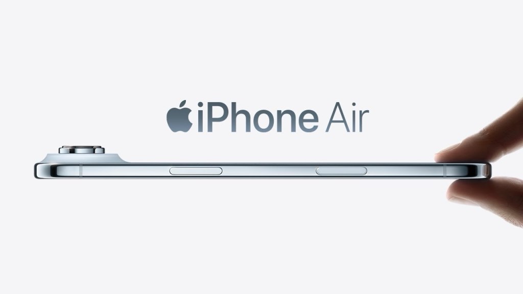
Buttons disappear slowly, not overnight
Interfaces evolve gently
New features are wrapped in familiar gestures
Apple doesn’t ask users to relearn technology. It asks them to upgrade their habits. That’s MAYA done right.
Tesla
Tesla cars look like… well, cars. Not spaceships. And that’s the point.
Electric drivetrain = radical
Steering wheel, pedals, seats = reassuringly normal
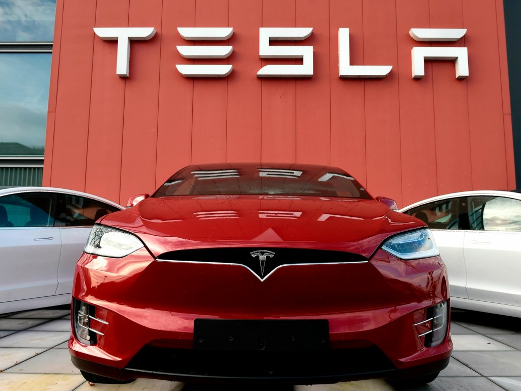
Sure, the giant touchscreen is a leap, but it’s offset by a familiar driving experience. You feel advanced without feeling lost.
Dyson
Dyson vacuum cleaners look like they’ve escaped from a science lab—but they still vacuum like, well, vacuum cleaners.
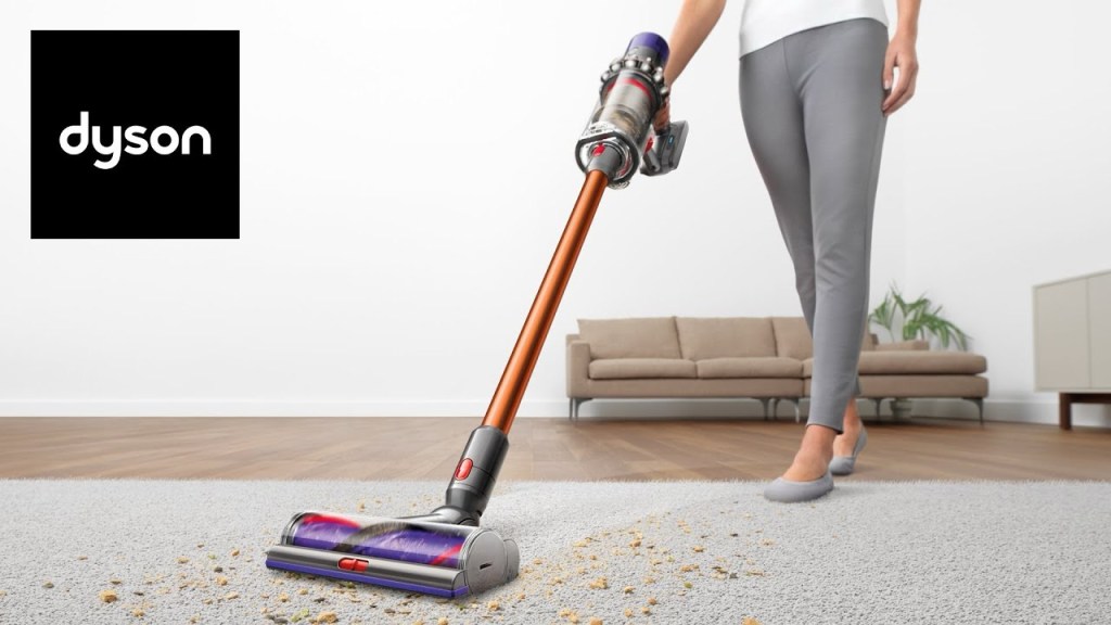
Transparent chambers = new
Same basic function = familiar
You’re intrigued, not intimidated. Which is why you end up paying more than you planned, while convincing yourself it’s an “investment”.
IKEA
Flat-pack furniture is a radical idea disguised as affordable familiarity.
Furniture looks normal.
Buying it feels new.
Assembling it feels like a test of character.
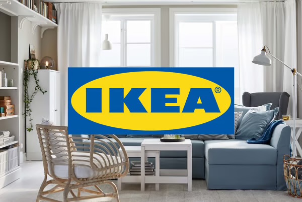
IKEA constantly experiments with form and function—but never so much that you can’t imagine it in your living room.
Who Uses the MAYA Principle?
Short answer: anyone who wants people to actually use what they design.
Long answer:
Product designers
UX/UI designers
Brand strategists
Architects
Advertisers
Tech companies launching “new” things that are actually just better versions of old things.
If your audience includes humans (which it usually does), MAYA applies.
When Should You Use the MAYA Principle?
Use MAYA when:
You’re introducing something new to a mass audience
Radical innovation needs familiar framing.
You’re redesigning an existing product or brand
Change enough to excite, not enough to alienate.
You want adoption, not just applause
People don’t buy what they don’t understand.
Avoid MAYA only when:
– You’re designing for extreme niche users
– You want to shock, provoke, or disrupt (art installations, concept cars, haute couture with no sleeves)
Otherwise, MAYA is your friend.
The Advertising Angle (Because Of Course)
In advertising, MAYA shows up as:
Familiar formats with unexpected twists
Known celebrities in surprising roles
Classic storytelling structures with modern attitudes
The best campaigns don’t feel alien. They feel like something you already liked, just sharper, smarter, and better dressed.
The Big Risk of Ignoring MAYA
Ignore MAYA and one of two things happens:
Your design is too safe → No one notices → No one cares
Your design is too advanced → People admire it → Then walk away slowly
Neither pays the bills.
Key Takeaway (Stick This On Your Wall)
Great design doesn’t ask users to change overnight.
It invites them to step forward—comfortably.
Or, in true MAYA spirit:
Be brave. But not so brave that people need a manual, a therapist, and a YouTube tutorial.
That’s the MAYA principle—Most Advanced Yet Acceptable.
And honestly? It’s probably why you like the things you like… even when you can’t quite explain why.
