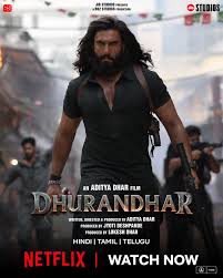
I watched Dhurandhar very, very late — the kind of late where the trailers have aged like milk and every second person on your timeline has already declared it the “best thriller ever” or “commercial cinema at its peak.” By the time I finally hit play, I was certain the movie would underdeliver. After all, how many films can actually live up to Pathaan-level hype and hold your attention without feeling like a glorified fireworks display?
Surprise (the good kind) — Dhurandhar did.
Yes, it’s inspired by real events, but that label feels like a humble accessory rather than a marketing tagline. The film doesn’t rest on “based on truth” the way some movies lean on troupes. Instead, it treats the real-world scaffold as a solid foundation and builds something cinematic, engaging, and — dare I say it — clever. What truly makes it work is not just the story but how that story sounds, feels and resonates with today’s audience. The background score and music elevate scenes in just the right way — powerful without drowning out the narrative.
Now to the meat: the performances — and there are many.
At the centre of it all is Ranveer Singh as Hamza Ali Mazari / Jasikirat Singh Rangi — an undercover agent whose transformation anchors the entire film. Ranveer doesn’t just play the lead; he carries the film on his shoulders, embodying his character’s fearlessness, vulnerability, humour, and quiet intensity like someone who genuinely lives in the role.
Opposite him, Akshaye Khanna portrays Rehman Dakait, the feared leader of the Lyari gang — a gangster with swagger and menace that never feels cartoonish. Akshaye delivers his performance with an icy precision that turns every scene he’s in into a small masterclass in controlled menace. It’s one thing to be intimidating; it’s another to make it look so effortless.
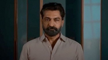
Then there’s Sanjay Dutt as S.P. Choudhary Aslam, the larger-than-life anti-extremist specialist whose presence injects the film with bursts of intense charisma. Dutt brings a gritty gravitas to the role, and his commanding physicality never lets you forget he’s not just part of the story — he owns his space in it.
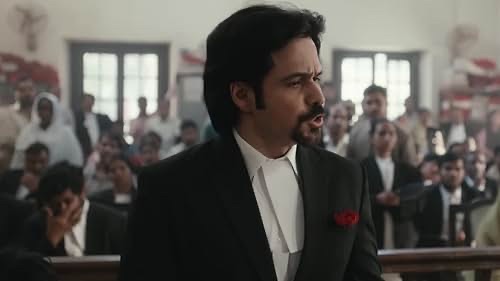
R. Madhavan as Ajay Sanyal, the strategic mind behind many of the covert operations, offers a calmer but no less compelling counterpoint. His performance is subtle and measured, giving the film emotional nuance at moments when it could easily have spiralled into only action.
Arjun Rampal, playing Major Iqbal, adds another layer of complexity — often unsettling — with an edge that sometimes feels too real for comfort. He’s intense, unflinching, and delivers one of the film’s most haunting sequences.
Among the supporting cast, Sara Arjun as Yalina Jamali has eye candy value and yes — the so-called “heroine” role you might feel was underutilised doesn’t fade entirely into the background, but compared to the weight carried by the ensemble around her, her arc feels a bit lighter.
Danish Pandor as Uzair Baloch and Rakesh Bedi as Jameel Jamali bring texture and grounding to the world, while Saumya Tandon as Ulfat adds moments of human warmth in an otherwise high-tension story.
The villains and supporting players don’t play for cheap shock value or exaggerated theatrics. Each brings a grounded credibility, which means when heat rises, it actually feels like heat — not just CGI fireworks.
What ties all these performances together is the confident direction of Aditya Dhar and a script that balances tone with spectacle. With such a massive cast, it would’ve been very easy for one actor to overshadow the rest — yet the film rarely lets that happen. Each performance has room to breathe, and the chemistry among the actors feels natural and well-orchestrated.
Cinematography is sharp, capturing gritty realism alongside sweeping, high-stakes drama. The background score complements rather than overpowers, giving emotional weight to scenes of tension, humour, and conflict alike. The direction doesn’t shy away from grim realities — instead, it presents them with purpose, contextualising every action and reaction without feeling didactic.
Certainly, Dhurandhar isn’t perfect. There are moments when its length can feel indulgent, and a few narrative detours might test your attention span. But if you stick with it, the emotional payoffs are worth it.
The film succeeds because it respects its audience — trusting you to piece together motives, consequences, and the moral weight of every decision. For once, the hype isn’t louder than the substance. And after sitting through three hours and thirty-odd minutes, I understand why audiences worldwide connected with it.
Was I surprised? Yes.
Did it deserve its success? Absolutely.
Am I looking forward to Dhurandhar Part 2? Without a doubt.