Discovering The Visit quietly streaming on Netflix feels a bit like opening a cupboard you haven’t touched in years and finding something unexpectedly sharp inside. Directed by the ever-polarising, frequently misnamed, but always fascinating M. Night Shyamalan, this 2015 thriller reminded me exactly why I became a fan back in his The Village era—when atmosphere mattered more than monsters and dread crept in politely before overstaying its welcome.
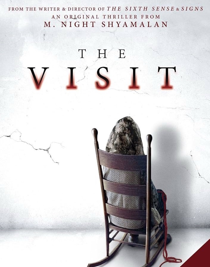
Made on a modest Blumhouse budget and armed with very few characters, The Visit wastes no time announcing itself as a lean, clever, deeply unsettling film that doesn’t scream for attention—it whispers, waits, and then suddenly has you gripping your sofa like an emotional support animal.
Let’s get this out of the way early: The Visit is not horror in the traditional “boo-in-your-face” sense. This is not about demons crawling on ceilings or jump scares doing cardio on your nervous system. Instead, it’s a slow, deeply unsettling thriller that crawls under your skin, makes itself comfortable, and politely refuses to leave. The kind of movie that makes you laugh nervously while thinking, I shouldn’t be laughing right now, should I?
The story begins with a woman estranged from her parents after a youthful romantic rebellion—she elopes (or maybe just runs away; the film keeps it real and messy), has two kids, and eventually ends up a single mother after her husband exits stage left. Years later, burdened with regret and unresolved emotional baggage (the kind that doesn’t fit in carry-on), her parents reconnect with her, and express a desire to meet their grandchildren.

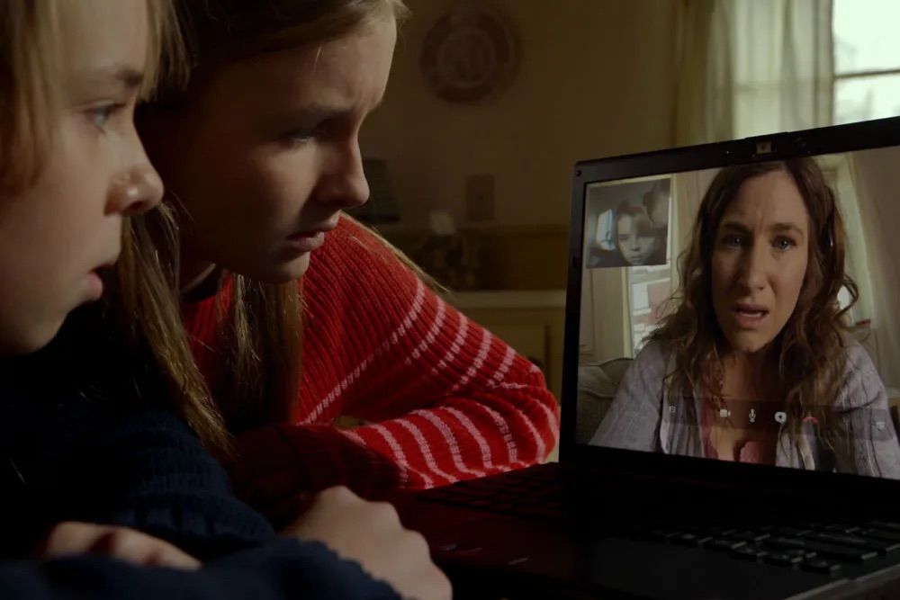
Enter the kids: a teenage sister and her younger brother—smart, observant, and refreshingly not written like horror-movie idiots. They’re curious, sharp, and armed with a camera because this entire film unfolds in a POV, mock-documentary style. Yes, that format has been overused, abused, and left in a ditch by many films before, but Shyamalan somehow breathes new life into it here. It feels organic, motivated, and—most importantly—effective.

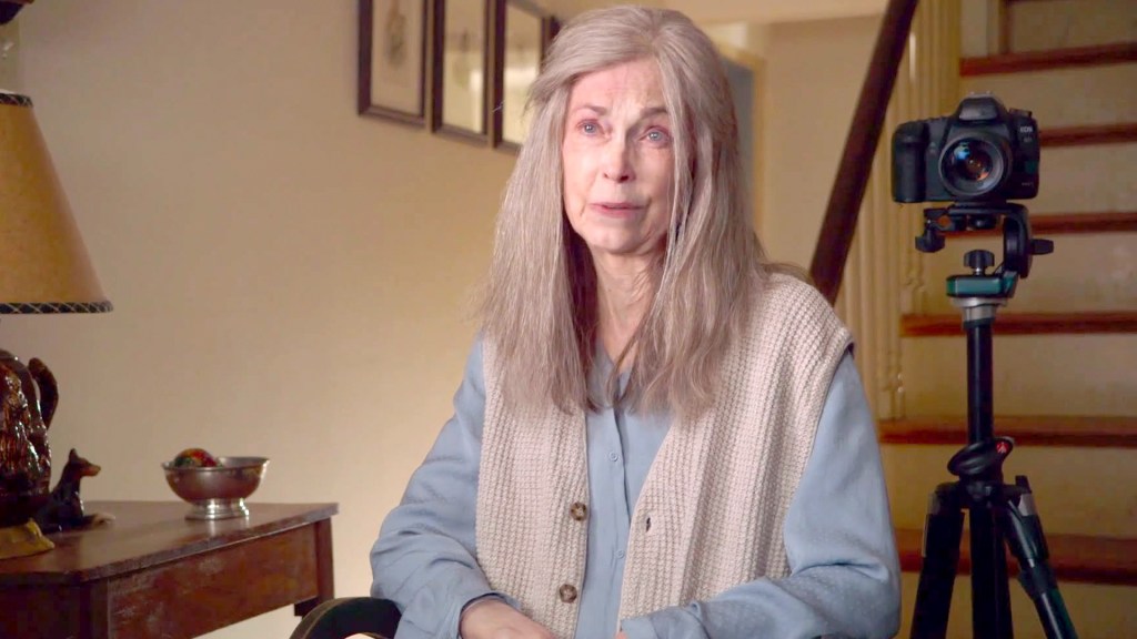
The grandparents live in rural Pennsylvania, in a house that initially looks like it belongs on a postcard titled Wholesome American Grandparents, Circa 1970. The hugs are warm, the food is hearty, and everything seems… fine. Too fine. And as any seasoned viewer knows, “fine” is cinema’s biggest red flag.
Strange things begin happening almost immediately. Grandma wanders around at night doing things that definitely don’t come with a senior citizen wellness brochure. Grandpa has his own mysteries, including a barn that practically screams, Please don’t ask follow-up questions. At first, these incidents feel quirky, maybe even darkly funny. Then they escalate. Rapidly. And suddenly, you’re no longer chuckling—you’re leaning forward, squinting at the screen, and wondering if you should’ve kept the lights on.
What truly elevates The Visit is its restraint. There are only five or six characters in the entire film, and yet it never feels small. In fact, the limited cast intensifies the claustrophobia. The kids are excellent—natural, believable, and emotionally grounded. The sister’s quiet intelligence balances perfectly with the brother’s awkward humor, which provides much-needed levity without undercutting the tension.
The mother, though largely present through video calls, delivers a strong emotional anchor. Her performance adds depth to the film’s underlying themes: how unresolved family conflicts ripple through generations, how children absorb the emotional fractures of divorce, and how silence between parents and grandparents can become its own kind of horror.
And then there’s the twist.
Ah yes. The Shyamalan twist. The moment you’re waiting for, fearing, doubting, and secretly hoping will land. Without spoiling anything, let’s just say this: when it comes, it arrives so casually, so offhandedly, that you may actually rewind the scene just to confirm you heard it right. No dramatic music sting. No flashing neon sign saying THIS IS THE TWIST. Just a quiet revelation that hits you like a delayed punch to the gut.
By the time the credits roll, The Visit feels both deeply unsettling and strangely satisfying. It’s proof that M. Night Shyamalan when working with constraints (and yes, even under the Blumhouse banner), can still deliver a tight, engaging, and thoroughly compelling story.
In short: great performances, a smart script, minimal characters, maximum impact, and a twist that reminds you why you started trusting Shyamalan in the first place—before he occasionally tested that trust. This is one visit you’ll be glad you made… even if you’re very happy to leave.