Some Sundays begin with grand plans. Brunch at a much-hyped restaurant, perhaps? Or maybe a lazy afternoon discovering that cozy nook everyone’s been raving about. This week armed with determination and empty stomach, we made it to Larder + Folk, nestled in the charming and ever-so-slightly disheveled Fontainhas area.
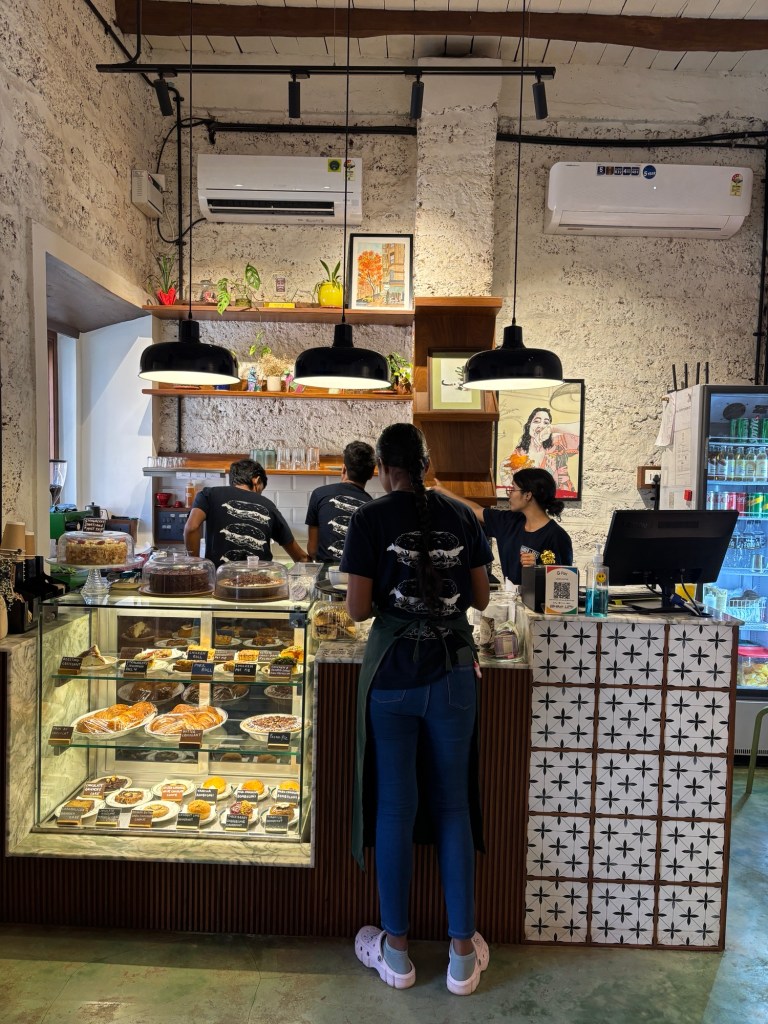
First impressions matter, and Larder + Folk knows it. The place is, quite simply, a vibe. Imagine a café plucked straight out of a cobblestoned alley in Europe and gently tucked into Fontainhas. It’s cozy, yes—seating that whispers “intimate” but might also scream “personal space invasion” if you’re a tad claustrophobic. Chairs are close enough that eavesdropping isn’t just possible; it’s inevitable. But somehow, you don’t mind. It’s all part of the charm.
Larder + Folk Seating
The interiors are, in a word, fab. There’s a certain deliberate chaos to the design—like they threw a Pinterest board into the air and let it land as it may, but miraculously, it works. Wooden tables, slightly mismatched chairs, and a bookshelf in the corner that screams, “I’m intellectual, but I also like my eggs sunny side up.”
Bookshelf
A well-stocked reception shelf greets you with baked sweets you don’t need but suddenly want. Cakes, croissants, savouries, things you buy because they make you feel like you’re living the life of someone who reads poetry and has opinions about wine.
Reception Area
The staff? Impeccably courteous. The type who smile like they’ve been waiting all week just for you to walk in. They glide around with plates of eggs, waffles, and coffee, weaving between tables and avoiding potential elbow collisions like it’s a sport.
Let’s talk about the crowd. Larder + Folk attracts a motley mix—a veritable buffet of people-watching. Locals sipping on their flat whites, foreigners who look like they stumbled in from a Wes Anderson film, and impeccably dressed individuals who somehow make “Sunday casual” look like a Vogue spread. There’s a vibrancy here, a subtle hum of conversation and clinking cutlery that makes the place feel alive.
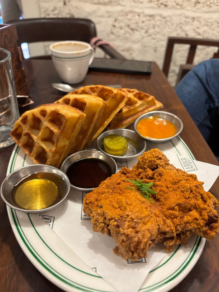
Now, onto the food. We started with the waffles and chicken—a dish I didn’t know I needed in my life until it arrived at the table.
Chicken and Waffles
It’s a curious pairing, the sweetness of the waffles tangoing with the saltiness of the chicken. I can’t say I was blown away, but it was interesting. Different. I’ll give it that.
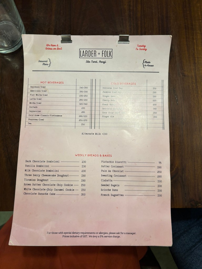
The Menu
We also had the scrambled eggs and toast with a side of bacon, which was solidly okay. Serviceable. Functional. The kind of meal you’d nod at politely but wouldn’t necessarily text about later.
Scrambled Eggs & Toast
And then there was dessert—or, in my case, a white chocolate cookie to go. A small indulgence for the road, because who doesn’t love wandering Fontainhas with a cookie in hand?
Here’s the thing about Larder + Folk: the food isn’t what will pull me back. It’s the vibe. The interiors that feel like a warm hug. The eclectic crowd, the cozy chaos of the seating, the way the café feels both local and worldly at the same time.
Would I recommend it? Absolutely—but not if you’re on a mission for culinary excellence. Go for the experience. Go for the ambiance. Go to pretend, just for an hour or two, that you’re sitting in a café in Paris or Amsterdam or some charming European town where the coffee is strong, the staff are kind, and the world outside can wait.
Quirky Art
In a nutshell, Larder + Folk is a little nook that feels like a warm escape, and honestly, isn’t that what we’re all looking for on a Sunday? This place is cozy, quirky, noisy and a tad bit smug about how cute it is. And frankly, I’m here for all of it!
In a world where attention spans are shorter than a TikTok video and competition is fiercer than Black Friday sales, getting your brand to stand out feels like an impossible mission. Enter the StoryBrand Framework—a marketing approach so clever and captivating it could make even the most boring brand sound like the next Hollywood blockbuster. Ready to find out how you can use it to woo your audience, boost sales, and live happily ever after? Let’s dive into this storytelling marvel!
What Is the StoryBrand Framework?
The StoryBrand Framework, created by marketing guru Donald Miller, is based on a simple but powerful idea: every brand should tell a story, and in that story, your customer is the hero—not your company. Yes, I hate to break it to you, but your company isn’t the knight in shining armor here. You’re more like the wise, quirky mentor helping the hero (your customer) conquer challenges. Think Yoda, not Luke Skywalker.
This framework flips traditional marketing on its head. It’s not about shouting how great you are—it’s about showing customers how you can solve their problems. Miller’s philosophy is built around seven key elements of storytelling, a structure borrowed straight from classic hero’s journey narratives.
Here’s the StoryBrand seven-part framework in a nutshell:
1. A Character (the hero = your customer)
2. Has a Problem (villain alert!)
3. Meets a Guide (that’s you!)
4. Who Gives Them a Plan (your solution)
5. And Calls Them to Action (buy the thing!)
6. That Ends in Success (happy ending = problem solved!)
7. And Helps Them Avoid Failure (nobody wants a tragic ending).
Simple, right? That’s the beauty of it. This structure taps into an ancient formula that humans instinctively understand and love.
How Does StoryBrand Apply to Marketing?
Let’s cut to the chase: if you’re not clearly telling customers how you can solve their problems, you’re losing them. Fast.
The StoryBrand Framework helps you simplify your message, so you don’t end up sounding like a jargon-filled robot. Customers don’t care about your industry awards, cutting-edge tech, or how your office has free kombucha on tap. What they care about is how you’ll make their lives better.
Here’s how StoryBrand works its marketing magic:
• Clarifies Your Message: You avoid the dreaded “curse of knowledge”—where you assume customers understand your complex offerings. (Spoiler: They don’t.)
• Builds Trust: When you position yourself as the guide, not the hero, you come across as helpful and approachable instead of self-centered.
• Drives Action: By painting a clear picture of what success looks like, customers are more likely to take action (a.k.a. buy your stuff).
What Is a StoryBrand BrandScript?
Ah, the BrandScript—the Holy Grail of the StoryBrand Framework! Think of it as your brand’s personalized cheat sheet to creating a compelling story.
The BrandScript breaks down the seven steps of the StoryBrand framework into actionable components. Here’s how it works:
1. The Hero (Customer): Who are they? What do they want? What keeps them awake at night?
2. The Problem: Define their external (practical), internal (emotional), and philosophical (moral) struggles.
3. The Guide (You): Show empathy (“We understand your pain”) and authority (“Here’s how we’ve helped others”).
4. The Plan: Lay out a simple, step-by-step roadmap for how your product/service will solve their problem.
5. The Call to Action: What do you want them to do? “Buy Now”? “Schedule a Call”? Keep it clear and direct.
6. The Success: Describe their life post-problem. Make it tangible, aspirational, and exciting.
7. The Failure: What happens if they don’t take action? Subtly highlight the stakes.
By the end of the BrandScript process, you’ve got a crystal-clear marketing message that’s ready to rock your website, ads, emails, and beyond.
StoryBrand Examples and Case Studies
Enough theory—let’s get to the fun part: real-world examples.
1. Apple (Yes, Again, but Hear Me Out)
Apple doesn’t just sell iPhones—they sell sleek solutions to your everyday struggles. Think about their tagline: “The ultimate device for everything you love.” It’s simple, customer-focused, and shows how they’ll solve your tech problems with ease.
2. Airbnb
Airbnb nailed the StoryBrand approach by making customers the heroes of their own travel adventures. Their messaging revolves around helping you “belong anywhere,” solving the problem of feeling disconnected in unfamiliar places.
3. Donald Miller’s Own Business
Meta alert! Donald Miller applied his own StoryBrand framework to his marketing agency. By offering workshops and guides on creating BrandScripts, he positions himself as the ultimate guide for brands navigating the murky waters of marketing.
Here’s an extended section with case studies and examples of how luxury brands, automobiles, and food brands have successfully applied the StoryBrand Framework or storytelling principles to elevate their marketing game:
4. Louis Vuitton: “The Journey Begins Here
Louis Vuitton doesn’t just sell luxury handbags—they sell the idea of adventure and timeless elegance. Their campaigns often focus on stories of wanderlust and personal exploration, with the luggage or handbag being a trusted companion on that journey.
• Hero (Customer): The sophisticated traveler with a taste for timeless style.
• Problem: Ordinary luggage doesn’t match their level of luxury or functionality.
• Guide (Louis Vuitton): A brand that understands the balance between heritage and modern design.
• Plan: “Pack your life’s moments with timeless sophistication.”
• Success: Customers feel stylish, confident, and unique wherever they go.
5. Rolex: A Lifetime of Achievement
Rolex’s marketing doesn’t scream “buy our watches.” Instead, it highlights moments of personal triumph and achievement. Their ads often showcase world-class athletes, adventurers, and leaders, implying that owning a Rolex is a mark of success.
• Hero (Customer): Someone ambitious, striving for greatness.
• Problem: How do you symbolize the milestones of success?
• Guide (Rolex): A trusted companion representing excellence and precision.
• Plan: “Wear a piece of history that matches your achievements.”
• Success: Customers feel rewarded for their accomplishments.
6. Chanel: The Power of Timeless Allure
Chanel has mastered the art of storytelling by focusing on their customers’ internal desire for sophistication and exclusivity. Their iconic tagline, “Coco Mademoiselle: I am who I am,” speaks directly to women who value individuality and class.
• Hero (Customer): A confident woman seeking elegance and self-expression.
• Problem: Mass-market products don’t reflect their unique identity.
• Guide (Chanel): A brand that offers exclusivity, empowerment, and timeless appeal.
Tesla isn’t just about selling electric cars—it’s about reshaping the future of sustainable transportation.
• Hero (Customer): The eco-conscious trailblazer who loves technology.
• Problem: Gas-powered cars are harmful to the planet.
• Guide (Tesla): An innovative brand offering a guilt-free driving experience.
• Plan: “Transition to sustainable energy with Tesla.”
• Success: Customers enjoy luxury and eco-friendliness without compromise.
• Example Campaign: The “Future of Driving” ads showcase Tesla’s technology and sleek design, positioning them as the perfect fusion of sustainability and style.
2. BMW: “The Ultimate Driving Machine”
BMW’s storytelling revolves around the emotional experience of driving—power, control, and freedom.
• Hero (Customer): Ambitious individuals who value performance and sophistication.
• Problem: Ordinary cars can’t provide the thrill or prestige they crave.
• Guide (BMW): A brand that offers unparalleled engineering and luxury.
• Plan: “Drive the ultimate expression of performance and elegance.”
• Success: Customers feel powerful, exhilarated, and prestigious behind the wheel.
3. Mercedes-Benz: “The Best or Nothing”
Mercedes-Benz tells a story of legacy, engineering perfection, and an aspirational lifestyle.
• Hero (Customer): The discerning professional seeking sophistication.
• Problem: They want a car that reflects their accomplishments and tastes.
• Guide (Mercedes): A brand synonymous with innovation, safety, and luxury.
• Plan: “Drive excellence, experience luxury.”
• Success: Customers feel successful and confident, knowing they own a masterpiece.
Food & Beverage Brands: Stirring Up Emotional Connections
1. Coca-Cola: Open Happiness
Coca-Cola’s “Open Happiness” campaign is a textbook example of storytelling that resonates across cultures.
• Hero (Customer): Everyday people looking to enjoy life’s simple pleasures.
• Problem: Life can feel stressful and disconnected.
• Guide (Coca-Cola): A brand that symbolizes joy, connection, and shared moments.
• Plan: “Open a Coke, open happiness.”
• Success: Customers associate the brand with warmth, connection, and celebration.
2. McDonald’s: “I’m Lovin’ It”
McDonald’s makes its customers the hero by focusing on the universal joy of sharing meals and creating memories.
• Problem: Choosing between indulgence and supporting ethical causes.
• Guide (Ben & Jerry’s): A brand that combines fun flavors with a commitment to social justice.
• Plan: “Enjoy the creamiest ice cream while supporting meaningful change.”
• Success: Customers feel indulgent and altruistic at the same time.
These examples highlight how storytelling, especially through the StoryBrand Framework, can transform luxury, automobile, and food brands into powerful, emotionally resonant forces. By making customers the hero of the story and positioning themselves as the guide, these brands not only win hearts but also drive business success.
The Red Ocean vs. Blue Ocean Debate
Quick detour: StoryBrand aligns perfectly with the Blue Ocean Strategy. Instead of competing in saturated “red oceans” full of bloody competition, StoryBrand helps brands carve out “blue oceans” by standing out with clear, customer-focused messaging.
Key Takeaways
Here’s what you should walk away with (besides a burning desire to rewrite your marketing strategy):
1. Customers Are the Heroes: Your marketing should revolve around their needs and aspirations.
2. Clarity Is Key: Confusion repels customers faster than bad Wi-Fi. Keep your message simple and direct.
3. Emotions Sell: Tap into your customers’ internal struggles to create emotional connections.
4. Guides Win Hearts: Show empathy, share expertise, and position yourself as the trusty mentor.
5. Call to Action: Don’t shy away from asking for the sale—your audience needs to know what to do next.
Start Growing Your Business with StoryBrand
So, how do you get started with StoryBrand? It’s as easy as pie (assuming you’ve got a good recipe).
1. Create Your BrandScript: You can DIY it using resources from StoryBrand, or hire a certified guide to help you.
2. Apply It Everywhere: Revamp your website, emails, social media, and ads with your new, crystal-clear messaging.
3. Test and Refine: See what resonates with your audience and tweak accordingly.
In the immortal words of Donald Miller , “If you confuse, you’ll lose”, stop confusing people with complicated jargon and start telling a story they actually care about. Your customers (and your bottom line) will thank you.
Now, go forth and write your brand’s epic tale. Just remember: every hero needs a guide, and you’re the Gandalf of this journey. Good luck, and may your conversions be ever in your favor!
Ahoy, my entrepreneurial friends! Let’s set sail into the vast, shimmering waters of strategy, where the most daring captains (or CEOs) navigate their businesses into uncharted territories, leaving their competitors drowning in their wake. Today, we’re talking about the Blue Ocean Strategy—a concept so refreshing, it might just be the strategic Piña Colada your business needs.
In this blog, we’ll explore:
1. What the Blue Ocean Strategy is
2. How it came into existence (Spoiler: It didn’t involve pirates or mermaids, but it’s still cool.)
3. Real-life examples of brands nailing the strategy
4. A dive into the murkier Red Ocean Strategy (where competition gets bloody—literally)
5. Key takeaways to help you navigate your business toward calmer, more profitable waters.
So grab your captain’s hat, because this is going to be a wild, yet fun, voyage!
What is the Blue Ocean Strategy?
Imagine a vast, serene ocean—a peaceful blue stretch where your business can float along without sharks (a.k.a. competitors) biting at your heels. That’s the Blue Ocean. Here, the rules are simple: create a market so unique, so innovative, that competition becomes irrelevant. Think of it as reinventing the game instead of simply playing it.
Blue Ocean Strategy is about ditching the crowded Red Ocean (where everyone fights for the same customers) and heading for clearer waters. Here, you don’t have to outsmart your competitors—you just leave them behind, waving a polite “bon voyage” as you sail away.
The goal? To create value innovation—a magical combination of differentiation (standing out) and cost efficiency. Essentially, you’re doing something no one else has done, while ensuring your customers and your balance sheet are smiling.
How Did the Concept Come Into Being?
The masterminds behind this strategy, W. Chan Kim and Renée Mauborgne, were probably staring at an aquarium one day when inspiration struck. Okay, maybe not. But the real story is just as fascinating.
The concept was introduced in their book Blue Ocean Strategy, first published in 2004. They spent years researching industries, analyzing market dynamics, and studying over 150 strategic moves spanning more than a century (talk about dedication). Their research led to a groundbreaking realization: companies stuck in the Red Ocean—endlessly competing—often see diminishing returns. Meanwhile, the real success stories come from businesses that break free and venture into uncharted markets.
Their approach became a game-changer, offering a structured framework for innovation, and the strategy has since been adopted by countless companies aiming to make waves rather than tread water.
Examples of Brands in the Blue Ocean Strategy
Let’s take a tour of some brands that have mastered the art of sailing in blue oceans. These companies didn’t just think outside the box—they shredded the box, built a yacht, and sailed it straight into uncharted territory.
1. Cirque du Soleil:
Remember when the circus was all about popcorn, clowns, and the occasional elephant? Cirque du Soleil said, “Nah, let’s make the circus sophisticated.” They blended theater, music, and stunning acrobatics, targeting an entirely new audience: adults willing to pay premium prices for an artistic spectacle. Result? They made traditional circuses obsolete and created their own blue ocean.
2. Nintendo Wii:
While Sony and Microsoft were battling it out in the console wars with power-packed gaming machines, Nintendo sailed in another direction. They created the Wii, targeting families and casual gamers with simple, interactive gameplay. Grandma bowling with the grandkids? Genius. By appealing to a broader audience, Nintendo dominated without directly competing.
3. Tesla:
Elon Musk didn’t just build electric cars; he built a lifestyle. Tesla redefined what electric vehicles could be—luxurious, high-tech, and cool. Instead of competing with traditional automakers in the Red Ocean, Tesla created an entirely new market of environmentally conscious, tech-savvy consumers.
4. Apple iTunes:
Remember the dark days of LimeWire and pirated music downloads? Apple entered the scene with iTunes, offering an easy, legal, and affordable way to buy music. They revolutionized the music industry and left the competition scratching their heads.
What is the Red Ocean Strategy?
Before we venture further into blue waters, let’s dip our toes into the murky, shark-infested Red Ocean. This is where most businesses operate—fighting over the same customers, cutting prices, and competing on razor-thin margins.
Think of it as a gladiator arena where companies battle for survival. You’ve got price wars, feature wars, and endless marketing gimmicks, all leading to diminishing returns. Sure, you might survive, but it’s exhausting, and the water around you is, well, bloody.
The Red Ocean Strategy isn’t necessarily wrong—it’s just limiting. It’s about grabbing a piece of the existing pie rather than baking a whole new one. And let’s face it, who doesn’t want their own pie?
Key Takeaways from the Blue Ocean Strategy
1. Think Different (Shoutout to Apple):
Innovation isn’t just about technology—it’s about reimagining what’s possible. Don’t settle for being better; strive to be different.
2. Focus on Value Innovation:
This isn’t just about cutting costs or adding features. It’s about creating a win-win for your customers and your business.
3. Look Beyond Existing Demand:
Stop chasing the same customers as everyone else. Find new audiences, new needs, and new opportunities.
4. Forget the Competition (Mostly):
Don’t waste time obsessing over your rivals. Instead, focus on carving out your own space where competition doesn’t even matter.
5. Be Bold:
Blue Ocean Strategy isn’t for the faint of heart. It requires courage, creativity, and a willingness to take risks. But the rewards? Totally worth it.
Sailing Tips: How to Chart Your Own Blue Ocean
So, you’re ready to leave the Red Ocean behind and set sail for bluer waters. Here are a few tips to help you navigate:
1. Reimagine the Customer Experience:
Ask yourself, “What’s frustrating about the current options?” Fix those pain points, and you’ve already got a head start.
2. Combine the Unlikely:
Take two unrelated ideas and mash them together. Cirque du Soleil combined circus and theater. What can you combine?
3. Question Industry Norms:
Why are things done the way they are? If the answer is “because that’s how it’s always been,” congratulations—you’ve just found your opportunity to innovate.
4. Map the Value Curve:
Identify the factors customers care about, then decide what to eliminate, reduce, raise, or create. It’s like Marie Kondo-ing an entire industry.
5. Keep Your Crew on Board:
Your team needs to buy into your vision. Inspire them, and they’ll help you steer the ship.
Conclusion: Why Settle for Red When You Can Have Blue?
The Blue Ocean Strategy isn’t just a business strategy—it’s a mindset. It’s about daring to be different, challenging the status quo, and creating something truly remarkable.
Sure, it’s not always smooth sailing. Venturing into uncharted waters can be risky, and you might face a few storms along the way. But the payoff? A market all to yourself, free from competition and full of untapped potential.
So, what are you waiting for? Hoist your sails, grab your map, and start charting your course. The Blue Ocean is calling—and trust me, the water’s fine.
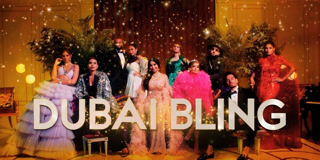
Season 3 of Netflix’s Dubai Bling is here, and let me tell you, it’s a whirlwind of drama, opulence, and characters that make you laugh, cry, and occasionally scream at your screen. While this season feels a little less scripted (thank God), it is by no means calm. If anything, it’s an unhinged rollercoaster ride with Ebraheem as its deranged conductor. Buckle up, because this season is crazy—and not the fun, “let’s party in a yacht” crazy. We’re talking “someone please stage an intervention” crazy.
Let’s dive into the madness, shall we?
The Curious Case of Ebraheem: A Rolling Stone Gone Wild
If there’s one person who grabs your attention this season, it’s Ebraheem. Unfortunately, it’s not because he’s charming or charismatic—it’s because he’s off-the-rails bonkers. Imagine a rolling stone barreling downhill, gathering not just moss but also grudges, petty plans, and an alarming amount of villain energy.
Ebraheem’s antics this season defy logic. He picks fights for sport, manipulates people like he’s auditioning for Survivor, and has the emotional intelligence of a tantrum-throwing toddler. At times, you’re left wondering if he even has a plan or if he’s just throwing darts in the dark. Either way, he’s officially become the villain of Dubai Bling. And not the lovable “bad guy” type. Nope, this guy is straight-up frustrating, and by the end of the season, you’ll find yourself yelling, “Netflix, why is this guy even here?!”
Zeina and Safa: From Drama Queens to… Zen Queens?
Speaking of unexpected transformations, Zeina and Safa have toned down this season. Yes, you heard me—toned down. Don’t get me wrong, Safa still does Safa things (like giving her car a send-off that belongs in a soap opera), but overall, these two are more chill than a Dubai brunch mimosa.
Zeina, on the other hand, steals the spotlight with a genuine “OMG” moment when she’s surprised with a new car. Her reaction? Priceless. You can almost feel the authenticity oozing through your screen, a rarity in reality TV.
Jwana and LJ: Frenemies to Forever
This season takes us on an emotional ride with Jwanna and LJ. Their story arc is like a well-paced novel: it starts with tension, builds up to intense confrontations, and finally ends with a sweet, unscripted reconciliation. The moment they make up? Chef’s kiss. It’s raw, it’s heartfelt, and it’s the kind of emotional payoff that reality TV rarely delivers.
LJ and Jwana brought an unexpected depth to the season, adding layers to the usual glitz and glamor. Their dynamic also gave us a break from Ebraheem’s shenanigans, which was much needed for our collective sanity.
Mahira: The Silent Storm
Mahira is the underdog of this season. She doesn’t like drama, but when it’s necessary, she stands her ground with a quiet strength. Unlike Mona Kattan, who stays neutral to the point of being boring (we’ll get to her later), Mahira knows when to step in and speak her mind. She’s graceful but not afraid to throw a few well-timed verbal punches.
Mahira is a breath of fresh air in a season that often feels like a high-stakes soap opera. She’s proof that you don’t need to scream to be heard. Sometimes, a firm, calm voice is all it takes.
Mona Kattan: Too Good to Be True?
Ah, Mona Kattan. The peacemaker. The fence-sitter. The Switzerland of Dubai Bling. While her neutral stance might work in theory, in practice, it’s frustrating. We get it—she doesn’t want to take sides. But sometimes, you just wish she’d pick a lane and drive.
Her husband, Hasan, on the other hand, is infinitely more interesting. He’s mysterious, intriguing, and adds a layer of complexity that Mona lacks. While Mona spends her time playing diplomat, Hasan keeps you guessing. Honestly, I’d watch a spin-off centered entirely on him.
DJ Bliss and Danna: The Sincere Duo
DJ Bliss and Dayna come across as the most grounded couple this season. Their sincerity shines through, even when they’re dealing with Ebraheem’s ridiculous antics. You can’t help but feel sorry for DJ Bliss during his conflict with Ibrahim. Spoiler: it doesn’t end well.
Dayna, for her part, is supportive without being overbearing. Together, they’re a rare example of normalcy in a show that thrives on excess.
Farhana and Herios: The Custody Chronicles
Farhana’s subplot involving visitation rights for her son is one of the more relatable storylines this season. Her struggle to balance logic and emotion makes her feel human in a way that many reality TV stars don’t. You might not agree with all her decisions, but you understand where she’s coming from.
Herios, on the other hand, remains slippery and hard to read. Is he genuine? Is he manipulative? Who knows? But their dynamic keeps you hooked, adding another layer of drama to an already packed season.
The Men: Fahad, Salem, and Hanna
Let’s talk about the other guys. Fahad is as neutral as ever, popping up occasionally to remind us he exists. Salem, however, comes across as sincere and endearing. He’s one of the few characters who feels grounded in reality, and his moments of honesty are a refreshing break from the chaos.
Hanna also has a strong season, revealing more of his personality. He’s not just a background player anymore—he’s a fully fleshed-out character, and it’s great to see.
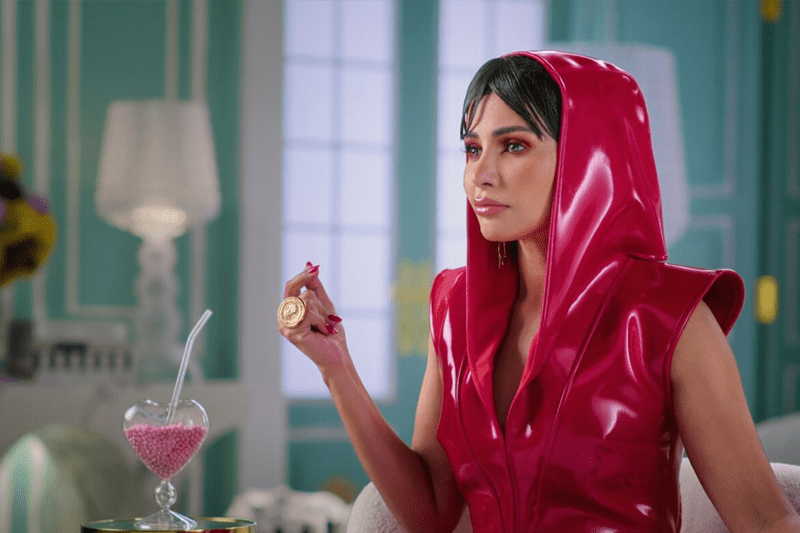
The Clothes
Let’s talk about the clothes—because, honestly, they deserve their own spinoff series. The wardrobes in Dubai Bling are so extra, so impossibly over-the-top, that you start to wonder if these people are dressing for a red carpet or a quick trip to the market. Sequins for lunch? Sure. Feathers for a coffee run? Absolutely. Full-on couture to grab a loaf of bread? Why not?
Now, I’ve been to Dubai, and yes, the people there are undeniably stylish—effortlessly chic, polished, and stunning. But this level of glam? It’s like the cast collectively decided that subtlety was for peasants. Every outfit is a walking statement piece, screaming, “Look at me!” while also whispering, “Do you even know how much this costs?”
Take Safa, for example. Her outfits looks like they came straight out of a Paris runway. And then there’s Mona Kattan, always dressed to look like she’s about to host an awards ceremony, even if she’s just heading to a friendly brunch.
The real question is: Do actual Dubai residents dress like this? Based on my experience, the answer is a resounding no. Sure, they’re stylish, but no one is pulling out Swarovski-encrusted gowns to buy cucumbers. The cast of Dubai Bling has clearly decided that in their world, there’s no such thing as being overdressed—because who doesn’t want to look like a walking chandelier on a Tuesday afternoon?
It’s ridiculous, it’s fabulous, and it’s a little addictive. You might roll your eyes, but deep down, you know you’d love to borrow one of those diamond-studded jackets—just for fun.
The Highlights and Lowlights
• Highlight: The LJ-Jwana reconciliation. It’s sweet, emotional, and gives the season a much-needed dose of authenticity.
• Highlight: Zeina’s car surprise. Her reaction is pure gold and proof that not everything on this show is staged.
• Lowlight: Ebraheem. Just… everything about him.
Final Thoughts
Season 3 of Dubai Bling is like a designer cocktail: flashy, over-the-top, and sometimes a little hard to swallow. It’s chaotic, entertaining, and occasionally maddening, but that’s what makes it Dubai Bling. While some characters shine and others fall flat, the season as a whole is a guilty pleasure that keeps you hooked.
So, grab your popcorn, pour yourself a fancy drink, and dive into the madness. Just be prepared for a wild ride—because in Dubai Bling, the drama never sleeps.
Gather ‘round, brand enthusiasts and casual observers alike! The year 2024 has been a whirlwind of rebranding escapades, with companies donning new identities like they’re trying on hats at a vintage store. Some fits are snug and stylish, while others… well, let’s just say they’re more “abstract art.” Let’s embark on this journey through the most talked-about rebrands of the year.
1. Abrdn: When Vowels Are So Last Season
Remember Standard Life Aberdeen? Neither do we, because they’ve rebranded to Abrdn (pronounced “Aberdeen”). In a move that left linguists clutching their dictionaries, the company decided vowels were overrated. CEO Jason Windsor stands by the choice, stating, “The name is the name,” which is as tautological as it is unhelpful. Despite the internet’s collective eyebrow raise, Abrdn is sticking to its consonant-heavy guns.
abrdn
Takeaway: Sometimes, rebranding is less about making sense and more about making headlines.
2. Campbell’s Soup: Stirring the Pot
After 155 years, the iconic Campbell Soup Company decided to drop “Soup” from its name, rebranding as The Campbell’s Company. This shift reflects their venture beyond soups into the lucrative snack market. While some consumers fear this change might lead to price hikes, others are just wondering if their beloved tomato soup is now considered a “drinkable snack.”
Takeaway: When life gives you soup, make snacks.
3. Zoom: From Video Calls to AI Calls
Zoom, the savior of remote work, has rebranded itself as an AI-first company, now known as Zoom Communications Inc. With features like the AI Companion, Zoom aims to summarize meetings and draft emails, potentially enabling a four-day workweek. Because nothing says “progress” like having a robot tell you what you just discussed.
Takeaway: In the future, even your small talk might be automated.
4. Jaguar: Pouncing into Controversy
Jaguar took a bold leap by rebranding as JaGUar, embracing vibrant colors and an emphasis on electric vehicles. This departure from their classic British elegance has sparked debates about the importance of heritage in branding.
Apparently, not everyone is ready for a neon green Jaguar zipping through the countryside.
Takeaway: Rebranding can be a wild ride; just make sure your audience is buckled in.
5. Pepsi: Back to the Future
Pepsi decided to tap into nostalgia by reviving its 1980s and ‘90s aesthetics. The new logo features the classic red, white, and blue globe paired with a modern sans-serif font.
It’s a nod to the past with a foot firmly in the present, much like wearing vintage jeans with a smartwatch.
Takeaway: Sometimes, the best way forward is a step back—preferably with a moonwalk.
6. RSPCA: From Stuffy to Snazzy
The RSPCA unveiled its first major rebrand in 50 years, ditching the somber blue and octagonal logo for a vibrant, digitally friendly palette. The custom font draws inspiration from protest placards, adding character and depth.
It’s a fresh look aimed at appealing to younger, diverse audiences, because who says animal welfare can’t be trendy?
Takeaway: Even the most established institutions can benefit from a makeover—just ask your grandma.
7. Eurostar: All Aboard the Chic Express
Eurostar revamped its image with a sophisticated rebrand, introducing a bold, sans-serif wordmark and a luxurious navy and gold color scheme. The design exudes European elegance, making your train ride feel like a first-class ticket to style town.
Takeaway: A touch of class can transform even the humblest of journeys.
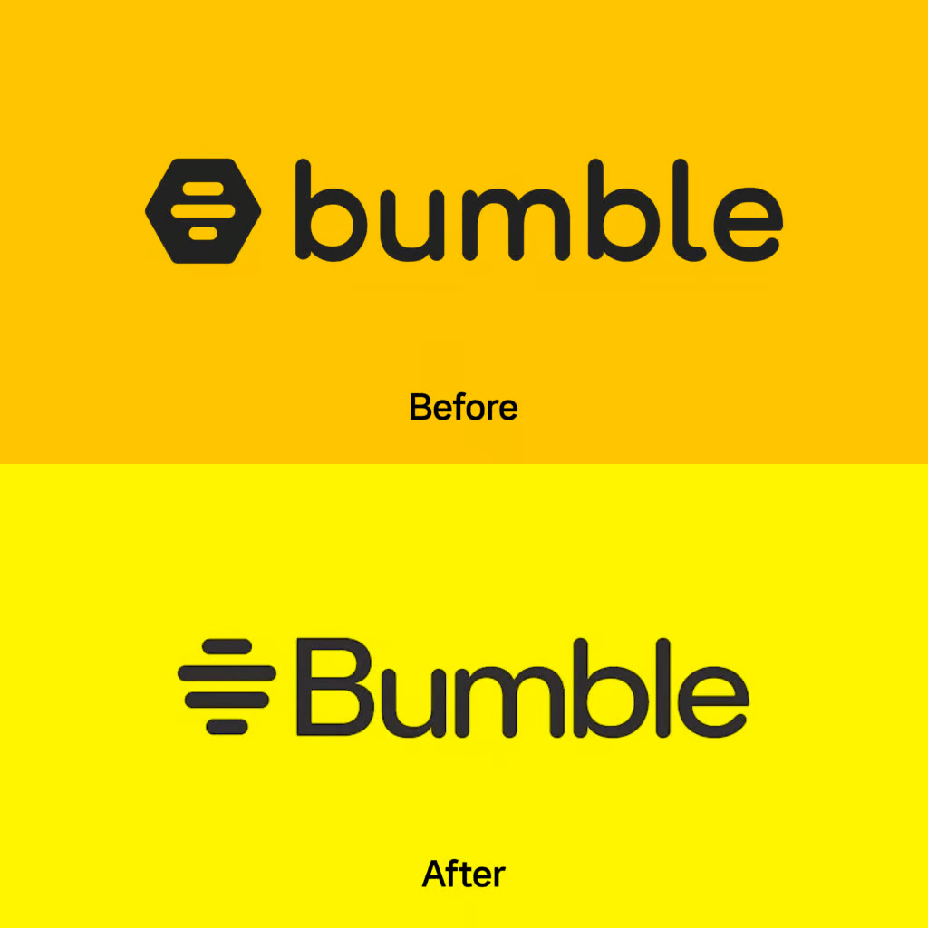
8. Bumble: Buzzing with Empowerment
Bumble refreshed its brand identity by simplifying its logo to a honeycomb-inspired symbol and tweaking its signature yellow to a warmer hue.
The update reinforces its commitment to positivity and building meaningful relationships, proving that even dating apps can have a glow-up.
Takeaway: A little polish can make your brand shine brighter in the crowded app store.
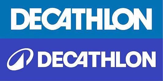
9. Decathlon: Sporting a New Look
Decathlon, the go-to for affordable sports gear, introduced a sleek, sans-serif wordmark and a vibrant color palette.
The addition of a new icon symbolizes motion and versatility, aligning with their mission to make sports accessible to all.
Takeaway: An energetic rebrand can breathe new life into even the most established retailers.
10. Coca-Cola: Classic with a Twist
Coca-Cola refreshed its brand by updating its color palette and typography to reflect a modern and sustainable approach.
The subtle changes aim to position the brand as environmentally friendly while maintaining its iconic status.
Takeaway: Even the classics need a little tune-up to stay relevant.
11. Instagram: Minimalism Meets Social Media
Instagram took a bold leap into the world of ultra-minimalism, trading its iconic gradient-heavy look for a sleeker, monochromatic design. The familiar hues of purple, pink, and orange have been softened into a streamlined, black-and-white interface.
While some users praised the design for being modern and chic, others complained that it now resembles a corporate presentation deck. “Where’s the personality?” lamented one Twitter user, who might still be mourning the loss of chronological posts.
Takeaway: Minimalism is great—until you strip away the fun.
12. Subway: Fresh Look, Same Sandwich Smell
After nearly 60 years of consistency, Subway took a bite out of the rebranding pie. Their new logo features a bolder font and a refined arrow design, symbolizing speed and efficiency (because apparently, we needed reassurance that sandwiches are fast). The real kicker? They unveiled their first menu overhaul in decades, with fresh ingredients and even fresher marketing campaigns. It’s a classic case of, “New year, new me—but still a six-inch sub.”
Takeaway: If your product hasn’t changed in decades, a rebrand is the lettuce to your branding sandwich.
13. Twitter to X: The Big Identity Crisis
Elon Musk’s takeover of Twitter didn’t just shake up the tech world; it sent branding enthusiasts into a frenzy. The company dropped its iconic bluebird logo, replacing it with a stark “X.” Why? Nobody really knows. While Musk described it as the “future of limitless interactivity,” many felt the rebrand was an unnecessary flex. Critics compared it to a sci-fi villain’s lair, while fans argued it was sleek and futuristic. Either way, it’s giving off strong “mid-life crisis” vibes.
Takeaway: Sometimes, rebrands are less about innovation and more about making noise—whether it’s the good kind or the bad.
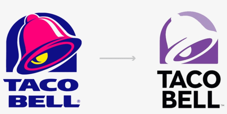
14. Taco Bell: Retro Revival
Taco Bell leaned into the retro trend with a nod to its vibrant 1990s branding. They brought back the funky, colorful designs that once adorned their wrappers and storefronts, much to the delight of Millennials looking for nostalgia with a side of nachos.
Paired with new, playful campaigns like “Live Más Throwback Thursdays,” the rebrand sparked social media buzz. Their message is clear: they’re here for the vibes, and maybe some tacos.
Takeaway: If your audience craves nostalgia, why not serve it up with extra guac?
15. Skype: The Quiet Comeback
Poor Skype. Once the reigning king of video calls, it lost its crown to Zoom during the pandemic. But instead of sulking, Skype quietly rolled out a rebrand in 2024, featuring a softer logo and a tagline emphasizing “human connection.” It’s like they’re whispering, “Hey, remember us? We’re still here… please call your grandma.”
Takeaway: In a crowded market, sometimes a rebrand is about gently nudging your way back into relevance.
16. Barbie: Riding the Wave of Movie Magic
Mattel’s Barbie franchise rode the massive success of the 2023 Barbie movie straight into a rebrand. Gone are the ultra-pink clichés; the new Barbie branding embraces inclusivity and empowerment with designs showcasing a diverse array of dolls and updated messaging like “You Can Be Anything.” The rebrand feels like Barbie finally grew up, trading her dream house for a thoughtful apartment with good Wi-Fi.
Takeaway: Cultural relevance + clever marketing =unstoppable branding magic.
Barbie proved that even icons can evolve, and sometimes, the right time for a rebrand is when the world’s already talking about you.
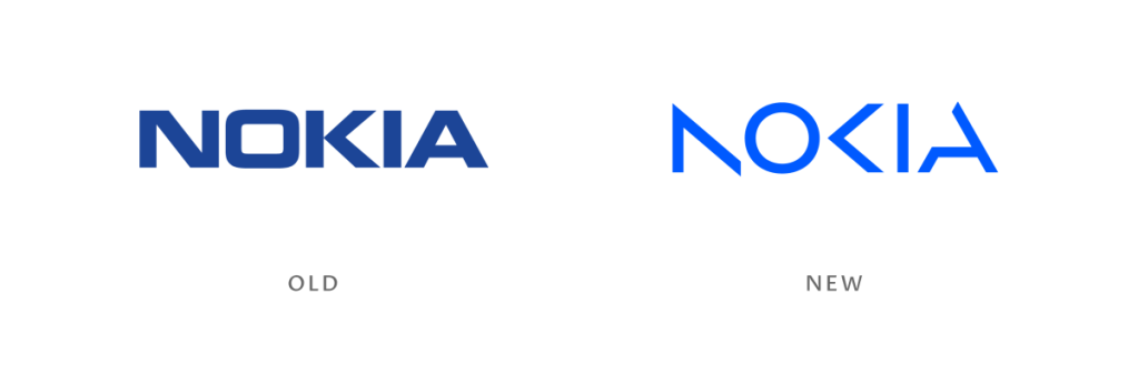
17. Nokia: A Blast From the Past, With a Future Spin
Remember when Nokia was synonymous with indestructible phones? Well, they’re back, and they mean business—literally. Nokia’s recent rebrand stripped away nostalgia and positioned them as a serious tech company focused on 5G, AI, and enterprise solutions. Their updated logo is sharp, modern, and completely unrecognizable to anyone still clutching their old 3310. Nostalgic fans were quick to tweet, “Bring back Snake!”
Takeaway: Rebrands can break away from nostalgia to build a futuristic identity, even if it means leaving your fan base scratching their heads.
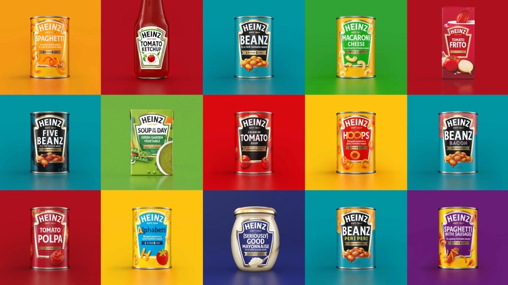
18. Heinz: Ketchup, But Make It Couture
Heinz has always been a pantry staple, but their recent rebrand gave the brand a fashionable edge. Emphasizing their iconic keystone label and premium quality, Heinz elevated their packaging with a minimalist, monochromatic palette.
They even launched a limited-edition designer ketchup bottle in collaboration with a luxury fashion brand. Social media couldn’t get enough of it: “Ketchup… but make it bougie.”
Takeaway: Even the simplest products can benefit from a glow-up if you blend timeless design with unexpected luxury.
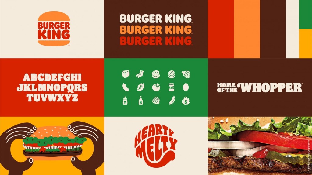
19. Burger King: Retro with a Side of Whopper
Burger King’s rebrand went all-in on the nostalgia trend, swapping its modern logo for a retro-inspired design reminiscent of its 1970s aesthetic.
The rebrand extended to packaging, uniforms, and even store designs, creating a cohesive “old is new” vibe. It’s a full meal of branding consistency that fans have been devouring—literally.
Takeaway: If it worked before, why not try it again? Nostalgia sells, especially when served with fries.
20. Adidas: Lacing Up Sustainability
Adidas recently rebranded to focus on sustainability, launching their “Run for the Planet” campaign.
They highlighted their eco-friendly products, including sneakers made from recycled ocean plastic, alongside a sleeker, simplified logo. The rebrand aims to show that the brand isn’t just keeping up with the times—it’s running ahead.
Takeaway: Aligning your brand with global concerns is more than just trendy; it’s necessary.
21. Airbnb: From Travel App to Lifestyle Brand
Airbnb’s rebrand expanded its focus from just travel to the broader concept of “belonging.” Their logo remains the same, but the messaging and campaigns emphasize unique, authentic experiences and community connections. With ads featuring everything from cozy cottages to castle stays, Airbnb isn’t just selling rooms—it’s selling dreams.
Takeaway: A rebrand doesn’t have to be visual; redefining your message can make your audience see your brand in a whole new way.
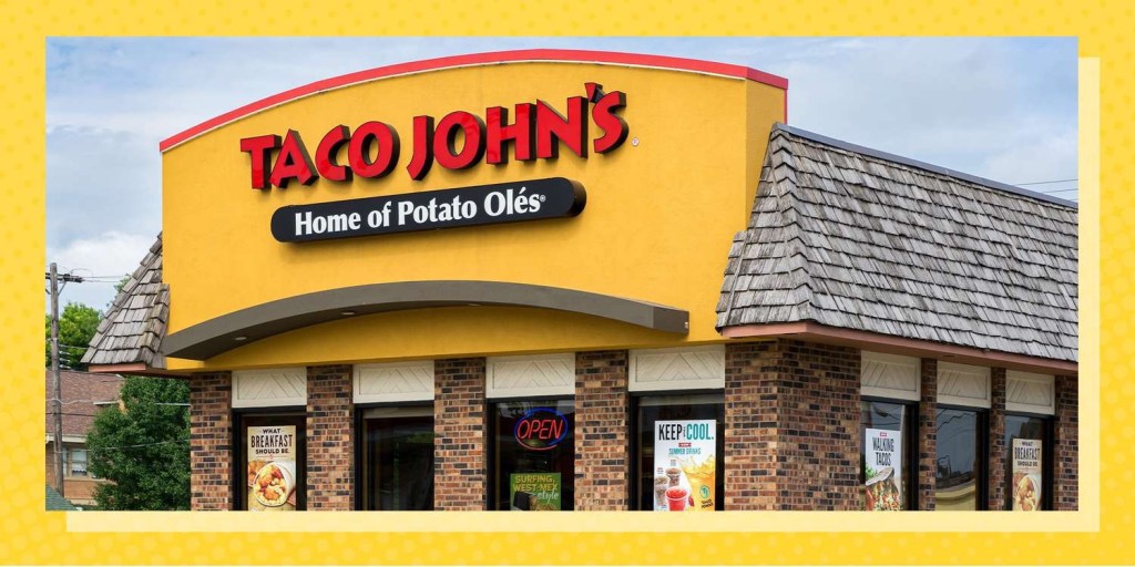
22. Taco John’s: Trademark Troubles Lead to Reinvention
Taco John’s made headlines in 2024 for losing their trademark on the phrase “Taco Tuesday,” thanks to a legal challenge by LeBron James. Rather than sulking, they embraced the moment with a cheeky rebrand, launching a campaign called “Taco Tuesday : The People’s Day.”
The logo stayed the same, but the messaging was all about fun and letting fans own the phrase.
23. Meta: Connecting the Dots (or Just Confusing Everyone)
When Facebook rebranded as Meta, the internet collectively scratched its head. The new name and infinity-loop logo aim to position Meta as a leader in the metaverse—whatever that means. While some applauded the forward-thinking vision, others joked that Meta sounds like a tech company trying too hard to be cool at a party.
Takeaway: Ambitious rebrands can be polarizing, but they also spark conversations—and isn’t that the point?
The Art of Rebranding: What We Can Learn
After dissecting these rebrands, it’s clear there’s no one-size-fits-all approach. Here are the key lessons we can learn:
1. Know Your Why: As Simon Sinek would say, always start with why. Whether it’s connecting with nostalgia, emphasizing sustainability, or adapting to new markets, your rebrand needs a purpose.
2. Timing Is Everything: Strike when the iron is hot. Whether riding a cultural wave (Barbie) or reclaiming relevance (Skype), timing can make or break your rebrand.
3. Nostalgia Sells, but Innovation Sticks: Tapping into nostalgia is great for short-term buzz, but innovation ensures longevity (Pepsi and Meta).
4. Be Bold, but Stay True: Don’t alienate your core audience while chasing new trends (Twitter X, looking at you).
5. Visuals Matter, But Stories Win: A shiny new logo is great, but it’s the story behind the rebrand that builds emotional connections (Zomato and Airbnb).
Closing Thoughts
Rebranding is a lot like giving your brand a makeover—it’s exciting, nerve-wracking, and a little risky. But when done right, it can catapult a brand into the next era. So, whether you’re ditching nostalgia for innovation, leaning into sustainability, or just giving your packaging a glow-up, remember this: your brand’s true power lies not in its look, but in its ability to resonate with your audience.
Now, go forth and judge these rebrands. Which one’s your favorite, and which one makes you miss the old days? Let’s discuss in the comments!
Imagine you’re at a party, trying to convince someone that your homemade kombucha is the greatest beverage known to mankind. You start by saying, “It’s packed with probiotics!” Crickets. Then you add, “It’s made with all-natural ingredients!” Still nothing. Finally, you blurt out, “It helps you feel amazing!” Boom! Their eyes light up, and they ask, “Where can I get it?”
That’s the power of Simon Sinek’s Golden Circle—a deceptively simple framework that flips traditional communication on its head. In this blog, we’re diving deep into the Golden Circle, unpacking its brilliance with case studies, practical takeaways, and tips for applying it like a pro. And yes, I promise to keep it fun—no dull corporate jargon here!
What’s the Golden Circle Anyway?
The Golden Circle is Simon Sinek’s brainchild, introduced in his 2009 TED Talk, “How Great Leaders Inspire Action.” The framework is built on three concentric circles:
1. WHY – The core belief or purpose driving everything you do.
2. HOW – The process or approach you use to fulfill your purpose.
3. WHAT – The tangible products or services you offer.
Most companies start from the outside and work their way in, shouting about what they sell and how they do it. But the most inspiring leaders and organizations flip the script—they start with why.
Here’s Sinek’s mic-drop-worthy insight:
“People don’t buy what you do; they buy why you do it.”
The Golden Circle in Action: Case Studies That Inspire
Let’s break this down with real-world examples that prove Sinek was onto something.
1. Apple: The Undisputed WHY Champ
Why Apple Wins Hearts
Apple’s why isn’t about selling gadgets; it’s about challenging the status quo and thinking differently. This belief resonates deeply, making customers feel like rebels just for buying an iPhone.
The HOW and WHAT
• How: Seamless user experiences and elegant designs.
• What: Computers, phones, watches, and more.
Their marketing doesn’t scream, “Buy our newest gadget!” Instead, it whispers, “Join the revolution.” And who doesn’t want to feel like a revolutionary while holding an overpriced phone?
Key Takeaway:
Start with a purpose that connects emotionally. Your why is your secret sauce.
2. Tesla: Selling a Mission, Not Just Cars
Why Tesla Zooms Ahead
Tesla’s why is crystal clear: accelerating the world’s transition to sustainable energy. This purpose hits home with environmentally conscious consumers who want to make a difference.
The HOW and WHAT
• How: Cutting-edge technology, innovation, and electric powertrains.
• What: Electric cars, solar panels, and batteries.
Tesla doesn’t just sell cars—they sell a better future. Their customers aren’t just buying vehicles; they’re buying into a movement.
Key Takeaway:
Make customers feel like they’re part of something bigger than themselves.
3. Nike: Just WHY It
Why Nike Inspires
Nike’s why is all about enabling human potential and celebrating athletes (of all levels). Their iconic slogan, “Just Do It,” isn’t about sneakers—it’s about empowering you to push past limits.
The HOW and WHAT
• How: Innovative products and emotional storytelling.
• What: Shoes, apparel, and sports gear.
Nike’s ads don’t feature endless product specs. Instead, they tell stories of triumph, grit, and resilience, leaving you pumped to conquer your own personal marathon (or at least the treadmill).
Key Takeaway:
Your why should inspire people to believe in themselves.
Applying the Golden Circle to Your Brand (Without Overcomplicating It)
Now that you’ve seen the Golden Circle in action, let’s talk about how to make it work for your business. Whether you’re running a startup, a coffee shop, or a personal brand, this framework can help you stand out.
1. Define Your WHY
Think about what truly drives you. Your why isn’t “to make money” (that’s a result). It’s the purpose or belief that fuels your passion.
Example:
• Boring WHY: “We sell handmade candles.”
• Compelling WHY: “We create warmth and joy in every home.”
2. Craft Your HOW
This is your unique process or approach. It’s what makes you different from competitors.
Example:
• “We hand-pour every candle using sustainable soy wax and ethically sourced fragrances.”
3. Nail Your WHAT
Now you can talk about your products or services—but do it in a way that connects back to your why.
Example:
• “Our candles come in a range of delightful scents to turn any space into a cozy haven.”
Golden Circle Applications: Taking It Beyond Business
The Golden Circle isn’t just for brands—it works wonders in other areas too.
1. Personal Branding
Want to ace a job interview? Lead with your why. Employers care more about your passion and purpose than your laundry list of skills.
Example:
• WHY: “I’m driven by a love for creative problem-solving and storytelling.”
• HOW: “I use data-driven strategies to craft compelling marketing campaigns.”
• WHAT: “I’ve managed successful campaigns for X, Y, and Z companies.”
2. Leadership
Great leaders inspire by starting with why. Think about Martin Luther King Jr.—he didn’t say, “I have a plan.” He said, “I have a dream.”
Takeaway:
Communicate your vision and rally people around a shared purpose.
3. Relationships
Yes, even your dating game can benefit from the Golden Circle. Don’t start with “what” (your job title or favorite pizza topping). Start with why—what drives you, excites you, and gets you out of bed in the morning.
Golden Circle Pitfalls to Avoid
1. Getting Stuck on WHAT: If you can’t move past your product features, your message will fall flat.
2. Faking Your WHY: People can sniff out inauthenticity from a mile away. Your why has to be genuine.
3. Forgetting the Customer: Your why should resonate with your audience—not just sound good in a marketing meeting.
Key Takeaways: Why the Golden Circle Works
• Emotional Connection: Starting with why taps into emotions, not logic.
• Differentiation: A strong why sets you apart from competitors.
• Loyalty: Customers who connect with your why are more likely to stick around.
In Conclusion: WHY Not Start Today?
The Golden Circle is more than a framework—it’s a mindset. By flipping the script and starting with why, you can inspire, connect, and stand out in a crowded market.
So whether you’re pitching a new business idea, building your personal brand, or, heck, even selling kombucha at a party, remember: People don’t buy what you do; they buy why you do it.
Now go out there and start with why. Your revolution awaits!
There’s something about Sunday mornings in Goa that compels you to step out of your weekday shell. Perhaps it’s the slow unravel of the state’s inherent charm, or maybe it’s just the simple allure of good coffee and a hearty breakfast waiting somewhere. This past Sunday, inspired by an appetite for adventure (and eggs), we decided to swap the usual beachside shack for a jaunt into Panjim, Fontainhas to be precise.
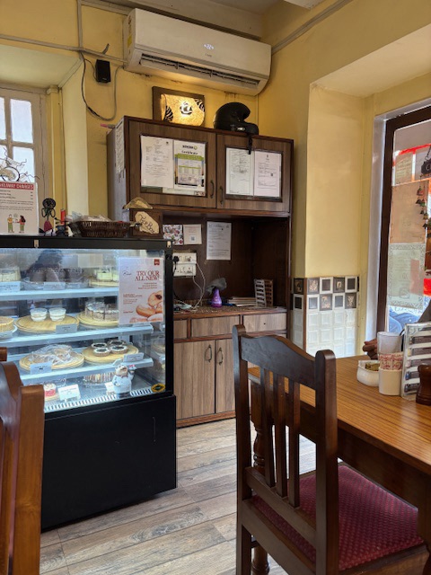
Caravela Cafe & Bistro, Fontainhas, Panjim, Goa
The original plan was to hit Larder and Folk—a name that rolls off the tongue almost as seductively as the Instagram reels promise you stacks of pancakes and aesthetically served lattes. But Goa, ever the free spirit, had other plans. Larder and Fork was bursting at the seams, and we, refusing to queue for toast, wandered down the cobbled lanes. That’s when we stumbled upon Caravela Café & Bistro, a tiny establishment that feels more like a secret you’ve just unearthed than a café you’d find on Tripadvisor.
From the outside, Caravela is unassuming—with a smattering of tables nestled inside a mustard-yellow façade of Fontainhas’ Portuguese-era houses. It’s the sort of place you’d walk past unless you were expressly looking for it, and honestly, that would be a shame.
The Setting: The Charm of Not Trying Too Hard
Inside, Caravela feels like your eccentric uncle’s living room. There’s no pretension here, just an effortless warmth. Mismatched furniture—wooden chairs that creak slightly when you sit, tabletops that have seen a spill or two—adds to its charm. The walls are sparsely adorned with curios that you suspect have been collected over years rather than bought as “props” to create a vibe.
There’s a chalkboard specials menu, of course, but your best bet is to ask for the more expansive menu.
The Menu: Simple Choices with Surprising Results
Scanning the menu, it’s clear that Caravela isn’t trying to reinvent breakfast. There’s no deconstructed avocado toast with sous-vide eggs nonsense here. Instead, it’s the classics—American breakfast, a healthy option, a few Goan twists, and some baked goods that sit temptingly in a glass display case.
We opted for the American Breakfast and the Healthy Breakfast Option. These choices, I’ll admit, were made after much deliberation because the café’s Goan-style chorizo pao and their homemade quiches were practically pleading to be ordered. But eggs and coffee before spice—always.
The American Breakfast: Nostalgia on a Plate
When the American breakfast arrived, it was less of a plate and more of a platter. Think eggs done exactly as requested (scrambled, fluffy, and cloud-like in my case), buttery toast, crisp bacon, a generous helping of sautéed mushrooms and hash browns. There was also a pancake, perched precariously atop the bacon, accompanied by a pat of butter melting languidly and a jug of syrup on the side.
The American Breakfast
The star of this breakfast was the bacon—perfectly crispy but not burnt, with just the right amount of chew. The hash browns were golden and crunchy on the outside, soft and comforting within, the kind of thing you’d happily eat by the fistful if no one were watching.
The Healthy Breakfast Option: Virtue Never Tasted This Good
The Healthy Breakfast
Next came the Healthy Breakfast, which, in many establishments, would be code for bland, joyless food. Not here. A vibrant plate greeted us, featuring a bowl of granola and yogurt and fresh fruit that tasted as though it had just been plucked from a tree, and a slice of sourdough that was wonderfully tangy.
There was an omelet involved, along with some delicious poie bread.
Omelet with poie bread
The coffee that accompanied these meals deserves its own applause. Robust, rich, and aromatic, it was brewed with care and served with no unnecessary frills. If you’re a coffee enthusiast, you’ll be pleased to know that Caravella leans into its roots with bean roasted to perfection.
House blend Coffee
The Ambiance: Slow Down and Stay Awhile
As the morning wore on, the café began to fill with a mix of locals and travelers. A young couple sat in one corner, sharing a croissant and the Sunday newspaper. In another, a group of friends animatedly discussed their plans for the day, plates of half-eaten quiche and cappuccinos scattered in front of them.
Caravela, we realized, wasn’t just a breakfast spot—it was a microcosm of Panjim itself. It’s where people come to linger, to watch the world go by, to escape the clamor of Goa’s more touristy hubs. It’s unhurried and unapologetic about being so.
Final Thoughts: A Place Worth Returning To
Caravela Café may not be the flashiest or most Instagram-worthy breakfast spot in Goa, but it doesn’t need to be. It’s a place with soul, a café that has quietly perfected the art of making you feel at home.
So yes, this Sunday, we ventured into Panjim hoping for something different, and Caravela gave us exactly that. It’s the kind of place you want to keep to yourself, but then again, it’s too good not to share. If you’re the type who finds joy in hole-in-the-wall discoveries, Caravela Café & Bistro is where you should be next Sunday morning. Just don’t tell everyone, okay?
When Squid Game burst onto Netflix in 2021, it felt like a cultural phenomenon. The first season was bold, emotionally charged, and undeniably thrilling. Naturally, the anticipation for Season 2 was sky-high. But after watching it, I can’t help but feel that the sophomore season, while decent, falls short of the groundbreaking intensity and storytelling finesse of the first.
What Worked (and What Didn’t)
Let’s start with the good stuff. The antagonist’s deeper involvement in the games this season added a layer of intrigue that kept me guessing. His presence was enigmatic, and the revelations about his motivations added a compelling dimension to the show. Season 2 also delivered on its production value—Netflix clearly spared no expense in making the series a visual spectacle.
However, the downsides of Season 2 are hard to ignore. The pacing felt uneven, especially with the excessive focus on the recruiter. While it was an interesting subplot, it dragged on too long, leaving little room for other elements to shine.
And then, there were the games themselves. Yes, Squid Game is known for its gruesome nature, but this time, it felt like the gore was cranked up just for shock value. By the time the players attempt to overthrow the guards—a scene that could have been a standout moment—the plot became convoluted. It lacked the clever strategy and suspense that defined the first season’s games. Instead, it came across as chaotic and unplanned, making me question the logic of these characters who are supposed to be driven by desperation and survival.
Additionally, there were several character arcs that seemed promising but ultimately went nowhere. It’s likely these threads are being saved for Season 3, but in Season 2, they felt like loose ends that detracted from the overall narrative.
One of the highlights of Squid Game Season 2 is how it dives deeper into the lives of the recruiter, the guards, and those working behind the scenes for the mastermind. Unlike Season 1, which focused entirely on the players’ desperation, this season gives us a glimpse of the humanity—or lack thereof—on the other side. We see the moral dilemmas, personal sacrifices, and eerie normalization of violence that come with their roles, adding a layer of complexity to the narrative. This perspective shift not only humanizes these characters but also makes you question the broader system they’re a part of, creating a more well-rounded exploration of the twisted world of Squid Game.
Marketing: Netflix’s Masterstroke
Netflix’s marketing team deserves a standing ovation, even if the series itself doesn’t. The global promotional efforts for Season 2 were nothing short of spectacular. From immersive events like recreations of the games in cities worldwide to influencer collaborations and interactive digital campaigns, Netflix ensured that Squid Game remained a topic of conversation long before the season dropped.
The marketing blitz was a testament to how much Netflix bet on Season 2—and it seems to have paid off in terms of viewership numbers. However, great marketing can only do so much when the core product doesn’t quite live up to expectations.
The Verdict
If Squid Game Season 1 was a flawless 10, Season 2 feels like a 5 or 6 at best. It’s not terrible by any means, but it lacks the finesse, emotional depth, and nail-biting tension that made the first season so memorable. The over-reliance on gore, uneven pacing, and underdeveloped subplots left me feeling a bit underwhelmed.
That said, the series does set the stage for what could be a thrilling Season 3. There are enough loose threads to keep viewers curious, and with the antagonist’s story gaining momentum, there’s potential for redemption.
For now, though, Squid Game Season 2 is a decent watch—not great, but worth checking out if only to see how the story progresses. Let’s just hope that Netflix puts as much thought into the next season’s storytelling as they did into its marketing.
The World’s Largest Congregation Meets the World’s Savviest Marketers
Every 12 years, the universe conspires to bring together millions of souls at the confluence of the Ganges, Yamuna, and the mystical Saraswati rivers in Prayagraj, India. This celestial gathering, known as the Maha Kumbh Mela, is not just a spiritual extravaganza but also a marketer’s paradise. With an estimated 400 million attendees in 2025 , brands are diving headfirst into the holy waters, hoping to cleanse their balance sheets and achieve the nirvana of consumer engagement.
Mahakumbh
The Divine Intersection of Faith and Commerce
The Maha Kumbh Mela is a melting pot of diverse backgrounds, cultures, and beliefs. For brands, it’s like finding the mythical pot of nectar—an opportunity to connect with a vast and varied audience in one place. From FMCG giants to tech innovators, everyone wants a piece of this spiritual pie.
Brands Baptized in the Holy Waters of Marketing
Let’s take a holy dip into how some brands are making their presence felt at the Maha Kumbh Mela 2025:
1. Dettol’s Divine Cleanliness Drive: Reckitt’s Dettol brand is on a mission to ensure a cleaner and healthier Kumbh Mela through its ‘Dettol Banega Swasth India’ campaign. They’re distributing millions of soaps at food-serving areas, promoting handwashing among devotees. Additionally, Reckitt is providing training for over 15,000 sanitation workers to enhance hygiene practices during the Mela.
2. ITC’s Spiritual Connect: ITC is leveraging its FMCG brands like Bingo! and Mangaldeep to create experiential engagement. Bingo! has set up booths that bring local culture to life, offering fusion dishes and interactive experiences for attendees. Meanwhile, Mangaldeep connects with the festival’s spiritual essence, hosting havans, bhajans, and digital engagement through augmented reality, making rituals like the ‘Kumbh Snan’ accessible to followers worldwide.
3. Coca-Cola’s Refreshing Presence: Coca-Cola India is pairing its beverages with local cuisine and immersive experiences, enriching the festival atmosphere. The brand is also promoting sustainability through initiatives focused on recycling and repurposing packaging, raising awareness about the environmental impact and encouraging collective action among visitors.
4. PhonePe’s Pilgrim Protection Plan: Understanding the unique needs of the pilgrims, PhonePe has launched a travel insurance plan specifically designed for attendees of the Maha Kumbh Mela. Available in two variants, the insurance offers coverage for both local and domestic travelers, ensuring a worry-free experience for devotees making their pilgrimage.
5. Dabur’s Digestive Delights: Dabur has tied up with dhabas and eateries in the city and on the highways to get consumers to sample its digestive brands like Hajmola. The company is spending on brand activations—for instance, it is setting up changing rooms for women devotees at ghats and baby care rooms, which will be branded with its hair care and baby care brands.
6. Patanjali’s Spiritual Synergy: Aligning with the spiritual ethos of the Kumbh, Patanjali has set up wellness camps offering yoga sessions, Ayurvedic consultations, and free samples of their products. Their presence reinforces the brand’s image as a promoter of traditional Indian wellness practices.
7. Airtel and Vodafone’s Connectivity Camps: Telecom giants Airtel and Vodafone have established connectivity zones equipped with free Wi-Fi and charging stations, ensuring that devotees can stay connected with their loved ones during the Mela. These zones also serve as touchpoints for promoting their latest data plans and services.
8. Unilever’s Sustainable Sanctuaries: Unilever has launched eco-friendly rest zones constructed from recycled materials, providing weary pilgrims with a place to rest. These sanctuaries also educate visitors on sustainability practices, aligning with the brand’s commitment to environmental responsibility.
9. Park+’s Parking Solutions: Understanding the logistical challenges of the Mela, Park+ has introduced smart parking solutions to help visitors find parking spots with ease. Their app provides real-time updates on parking availability, reducing congestion and enhancing the overall experience for attendees.
10. IIFL’s Financial Literacy Camps: IIFL has set up financial literacy camps to educate attendees on managing personal finances, investments, and savings. By offering free consultations and workshops, they aim to empower individuals with financial knowledge, fostering goodwill and trust in their brand.
The Economics of Devotion
Industry experts predict that brands will pour in a staggering ₹1,800 crore to ₹2,000 crore in advertising campaigns, marketing activations, and digital amplification during the 50-day event. This massive investment underscores the significance of the Maha Kumbh Mela as a prime opportunity for consumer engagement.
What Makes These Campaigns Successful?
The success of branding efforts at the Maha Kumbh Mela lies in their ability to seamlessly integrate with the festival’s themes. Campaigns work best when they:
1. Address Immediate Needs: Providing solutions to the challenges of attending such a massive event (e.g., cleanliness, connectivity, hydration).
2. Align with Spiritual Themes: Embodying values like health, well-being, and community resonates deeply with participants.
3. Leverage the Scale: By thinking big and impactful, brands can maximize visibility among millions.
4. Emphasize Local Relevance: Tying campaigns to Indian culture and traditions ensures authenticity and emotional appeal.
Emerging Trends at Kumbh 2025
• Sustainability-Focused Initiatives: Brands are using eco-friendly materials and promoting recycling to align with growing environmental consciousness.
• Interactive Experiences: From VR storytelling to mobile apps that guide pilgrims, companies are experimenting with immersive engagement strategies.
• Influencer Pilgrimages: Many brands are collaborating with digital influencers and content creators to share the festival’s story through personal, relatable lenses.
Conclusion: Marketers, Take the Plunge!
Whether you’re a small business or a global corporation, the Maha Kumbh Mela is proof that a well-thought-out campaign can leave a lasting impact. The secret lies in blending your brand’s vision with the ethos of the event.
And if you’re reading this while sipping chai from your office, don’t wait another 12 years. The next big event might be around the corner. So, gear up, think creatively, and maybe, just maybe, your brand will take a holy dip into the pool of marketing success.
In a world of glossy, high-budget commercials and cinematic ad masterpieces, something weird is happening. Brands are going low. I mean, really low-fi. Forget drone shots and million-dollar CGI. Lo-fi ad campaigns are here, and they’re messy, clumsy, and (surprise!) absolutely brilliant.
But wait… what is a lo-fi ad campaign?
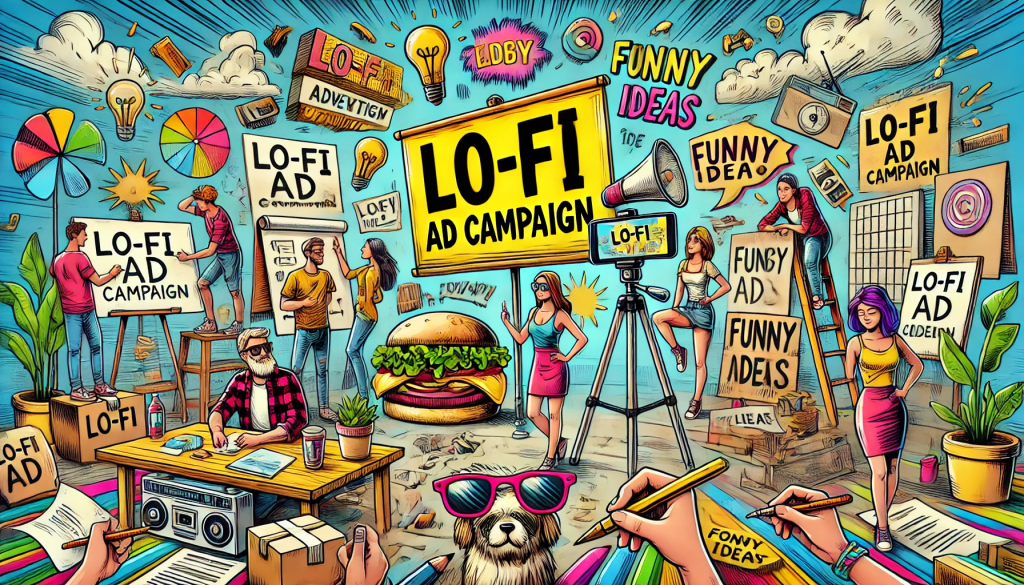
What the Heck Is a Lo-Fi Ad Campaign?
Think of lo-fi ads as the “sweatpants” of the advertising world—relaxed, relatable, and refreshingly real. These ads ditch the polish of big-budget productions and embrace simplicity, rawness, and authenticity. Lo-fi campaigns are often shot on smartphones, use unpolished visuals, and rely on humor, irony, or nostalgia. They’re the TikTok videos of advertising: real, relatable, and sometimes hilariously awkward.
The beauty of lo-fi? It’s not trying too hard. And in an era where audiences can smell fake authenticity from a mile away, this unpolished approach feels like a breath of fresh air.
Lo-Fi Ad Campaign
Why Are Lo-Fi Campaigns Taking Over?
1. Relatability is King: People love seeing ads that feel like something they (or their clumsy cousin) could’ve made.
2. Budget-Friendly: Why spend $10 million on a Superbowl ad when you can shoot a TikTok in your backyard and get the same attention?
3. Social Media Gold: Lo-fi content fits perfectly into platforms like Instagram, TikTok, and YouTube, where audiences crave authentic, engaging posts.
4. Nostalgia Appeal: These campaigns often mimic old-school aesthetics, giving off retro vibes that Millennials and Gen Z adore.
5. Anti-Perfection Movement: People are tired of airbrushed perfection. Lo-fi ads scream, “We’re just like you!” (even if they’re not).
How to Create a Lo-Fi Ad Campaign in 5 Simple Steps
Ready to embrace the mess? Here’s how to cook up a lo-fi ad campaign that slaps:
Step 1: Ditch the Fancy Gear
Put down the $5,000 camera and pick up your phone. Bonus points if your footage is a little shaky or slightly out of focus. Authenticity trumps production value.
Step 2: Embrace Awkward Humor
The best lo-fi campaigns lean into cringey, self-aware humor. Think of that one friend who’s unintentionally funny because they’re so awkward—that’s the vibe you’re going for.
Step 3: Keep It Real
Your talent doesn’t need to be models or actors. Use your intern, your neighbor, or your dog. The more “real,” the better.
Step 4: DIY Everything
From props to costumes, make it yourself (or borrow from your mom’s garage). Handwritten signs? Perfect. Cardboard props? Even better.
Step 5: Be Platform-Native
Lo-fi thrives on TikTok, Instagram Stories, and YouTube Shorts. Create content that feels like it belongs on the platform—not an ad interrupting it.
5 Viral Lo-Fi Ad Campaigns That Got It Right
Let’s look at some brands that nailed the lo-fi aesthetic and made millions laugh along the way.
1. Ryan Reynolds’ Mint Mobile Ads
When Ryan Reynolds launched his budget wireless company, Mint Mobile, he didn’t spend millions on slick ads. Instead, he used green screens, awkward jokes, and even stock footage to keep things hilariously simple. One ad featured a bar graph comparing Mint Mobile’s pricing to competitors with Reynolds narrating, “Look at this—it’s science!” The lo-fi charm was chef’s kiss.
Why It Worked: People loved the self-deprecating humor and the budget aesthetic—it matched the brand’s “affordable and honest” image.
2. TikTok’s Own Ads
TikTok’s ads about… TikTok? Meta. Instead of overthinking it, they showed users making goofy, relatable content. One ad was just a series of TikTok creators dancing badly, pulling pranks, and lip-syncing poorly. And you know what? It worked.
Why It Worked: It showcased the raw, lo-fi nature of TikTok itself. The campaign felt like an extension of the platform, not a corporate ad trying too hard.
3. Supreme’s Grainy VHS-Style Campaign
Streetwear brand Supreme went retro with a lo-fi campaign shot entirely on grainy VHS tape. The shaky footage, random cuts, and muffled audio felt like a 90s home video—and fans couldn’t get enough.
Why It Worked: It tapped into nostalgia while perfectly aligning with Supreme’s edgy, counter-culture vibe.
4. Burger King’s Moldy Whopper
Burger King made headlines by releasing an ad showing their Whopper decomposing over 34 days. Shot in time-lapse with no fancy editing or voiceover, the campaign boldly declared, “We’re removing artificial preservatives.”
Why It Worked: It was raw, real, and almost too gross to look away. The lo-fi aesthetic made the message (natural is better) even more powerful.
5. Fenty Beauty’s TikTok Campaigns
Instead of hiring Hollywood talent, Fenty Beauty tapped into TikTok creators to make lo-fi, user-generated-style content. These influencers showed off Fenty products with quirky transitions, clumsy dances, and relatable reviews.
Why It Worked: It felt organic and blended seamlessly with everyday TikTok content, making users trust the brand.
The Secret Sauce of Lo-Fi Ads
So, what’s the magic ingredient in lo-fi campaigns? It’s not about looking cheap. It’s about feeling real. Audiences today want brands to talk to them, not at them. Lo-fi ads make brands seem approachable, like that cool friend who doesn’t care about looking perfect.
When Should You Avoid Lo-Fi?
Not every brand can—or should—go lo-fi. Imagine if a luxury watch company tried to make a lo-fi campaign. Rolex with shaky camera work? Nope. Lo-fi works best for brands that:
• Have a playful, casual, or rebellious image.
• Want to connect with younger audiences.
• Can afford to experiment without harming their reputation.
Final Thoughts: Lo-Fi Is Here to Stay
Lo-fi ad campaigns are more than a trend—they’re a shift in how brands communicate. In a world where everyone’s trying to keep it “real,” these campaigns cut through the noise by actually doing it. So, embrace the awkward, the messy, and the wonderfully imperfect. Your audience will thank you (and maybe even laugh along).
Now go make a lo-fi ad. Just remember: the shakier, the better.
What’s your favorite lo-fi campaign? Share your thoughts in the comments below!